Btrax Design Company > Freshtrax > Logo Love: 5 Gr...
Logo Love: 5 Great Logos You’ve Probably Never Seen

Not many things in life get better as they age, but your corporate logo design should be an exception. As the “face” of your company, it should stand out in a crowd, remain consistent across all collateral, and convey a sense of your work and values.From consumer packaged goods to legal documents to a culture of people, these are some of the best little-known logos, according to Designer Shirley Wu. Here’s what she has to say:
There are a myriad of logos out there and a lot of them aesthetically look great, but what I define as a good logo is when it offers flexibility, represents the company accurately, and is timeless lasting the company for many years.

Plum has a memorable wordmark that allows for flexibility in terms of readability and minimum size. What I find so great about this particular logo is that at first glance your read “plum” as a whole word but after examining it for a few more seconds, the “u” and “m” are cleverly incorporated together. The serif typeface allows for a timeless look and feel which is perfect for those in the creative industry. Plum offers two services which are media consultancy and creative telecom. In this case, less is more.
![]()
Winepire has a signature that incorporates both modern and luxury into their logo. Slightly similar to Toblerone, the well-known chocolate, the bat utilizes the negative space as a wine chalice for the body. The sharp angles that the bat offers a modern and sleek look which would look great paired with a sans serif typeface like Futura; however it has a ever so slight grunge texture incorporated to the bat wings making it look a bit aged. Through the texture, the logomark allows the signature to be paired with a serif typeface which gives a feel of sophistication. This is definitely something Batman would have in his wine cellar!
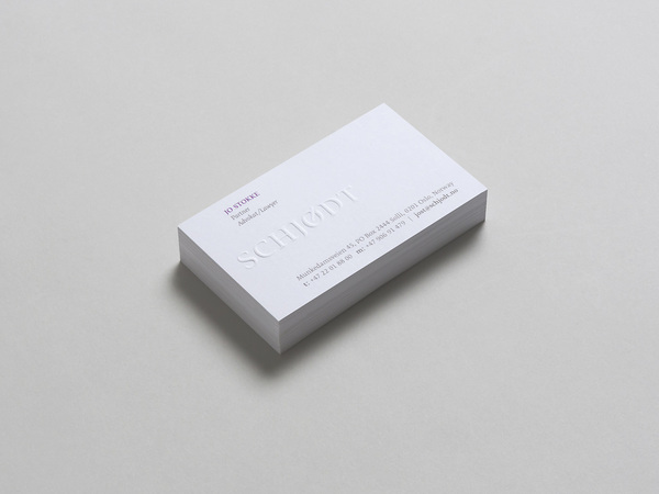
Schjodt is a law firm in Norway that has a simplistic wordmark. I’ve done my fair share of logo research and I find that law firms are one of the more difficult companies to brand. The reason why this is in my top five is because their branding is flawless. Though it’s simple, it utilizes that tick mark in the Ø which can be a pen striking part of the logomark as their identity in their applications. The corporate identity reads as a strong firm logo that is timeless, won’t require continuous re-branding and has sophistication.
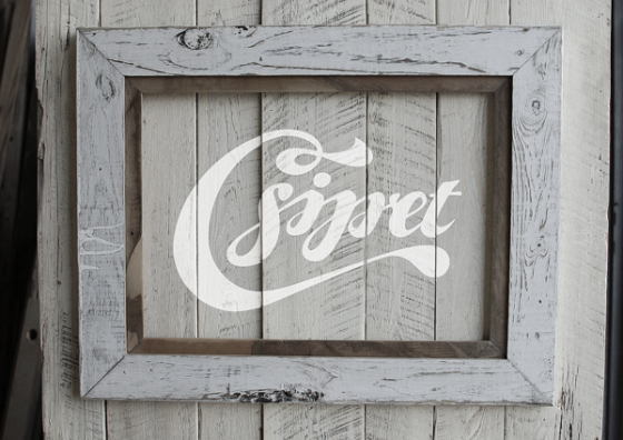
Csipet is a pasta restaurant that has a flowy script wordmark. A logo can define the look and feel of the restaurant, ambiance, and more which in this case gives a very welcoming environment. Csipet’s wordmark has a smooth flow which looks great used as signage and gives the feel that the restaurant has been around for quite some time. Though it may just look like script type, it’s important that a script wordmark flows smoothly, otherwise it would look forced and create inconsistencies throughout the identity.
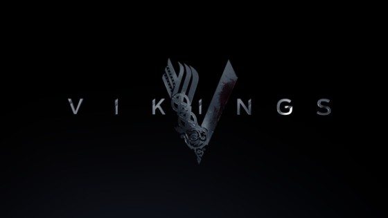
A logo is something that represents a brand or image and this one tells us the story of the Viking’s culture. Viking is a logo that shows the spirit of the viking’s culture and their signature is very impressive and very well thought out. The concept in creating the signature was to take elements of the viking and harmonize them together. In one logomark, violence, conflict, technology, brotherhood, growth, and life are incorporated, creating multiple dimensions within one strong mark.
Though I don’t find this particular logo to offer flexibility, it’s one with flawless execution in art direction. I found this beauty months ago, and even today it’s still very memorable. As you can see, deciding on the right logo is crucial to a company’s success—and changes get harder to make the bigger you get. So take that extra time into designing an attractive logo that your Facebook fans won’t be ashamed to share, and you’ll be grateful for it in the long run. See how btrax designed a logo for Start Up Weekend Bay Area from start to finish.
Check Out Our FREE E-Books!
Discover our FREE e-books packed with valuable research and firsthand insights from industry experts!

Dive into our collection below, and stay tuned – we’re constantly adding new titles to keep you ahead of the curve.
- Big in Japan: Global Brands Thriving in the Japanese Market, Vol. 1
- A Guide to the Promotional Seasons in Japan
- What I Wish I Knew Before Entering the Japanese Market
- 100+ Facts to Understand the Motivations Behind Japanese Behaviors
- Insights on Japan’s Changing Workstyle
- Insights into Japan’s E-Commerce and Direct to Consumer (D2C) Market