
Btrax Design Company > Freshtrax > Differences Bet...
Differences Between American and Japanese User Experience Design
User Experience (UX) Design is a design process used to make products, services, or systems easy for people to use. An important part of the UX design of a website is the user interface (UI) design, which helps the user interact with the site. UI is the look and feel of the product, service, or system. As the realm of digital experiences continues to grow, aesthetically pleasing user interfaces (UI) are becoming a secondary element to draw users. However, the adaptability of design across a variety of mediums allows UX designers to not only create smooth interactions with great UI, but also designs that are localized for different cultures. When observing a person’s user experience on various websites, we learn that it is crucial to understand the impact and nuances of cultural context and user needs.
In this article, we look at American and Japanese UX design on different websites, analyze different touchpoints to consider when localizing the UX design, and compare how users in Japan and America respond to these touchpoints.
How UX and UI affect localization
Let’s get one fact straight, localization is NOT just translating content. Translation often neglects cultural differences and is not enough to reach or build trust with your desired target audience.
Instead, localization changes the look and feel of the service to fit the same expression of words and imagery of the original cultural context. Adapting user interfaces for other cultures affects the overall user experience, which helps connect design with the user’s habits and values and how information is interpreted by the user.
【Related article】Essentials of Localization: Recreate the Experience with Imagination, Creativity, and Expertise
Elements of American and Japanese UI design
Much of the user’s journey throughout a website interface is directed by learned visual cues. We will look at how these visual cues relate to color psychology, typography, the hierarchy information, and the platform.
Color psychology
Color psychology is one main factor that can influence the user flow, the designed path a user takes to achieve a task, from one web page to another. For example, Japan’s association with the color red contrasts from America’s interpretation of the same color.
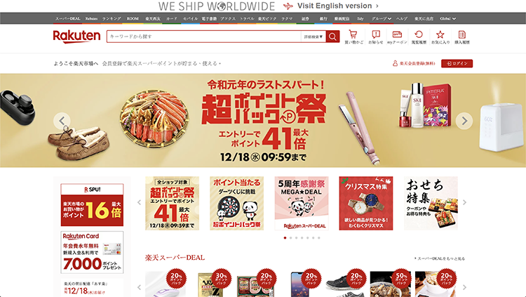
(Source: Rakuten Japan 2019)
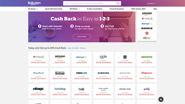
(Source: Rakuten USA 2019)
In Japanese UI design, red is correlated to boldness or positivity while in the US, red correlates to emphasis or error. Thus, the experience will change based on color choices when creating a call-to-action (CTA) and can impact conversion rates. As you can see in the images above, Rakuten’s Japanese website utilizes red to attract users to its advertisements while its American website emphasizes shopping deals with red.
Typography
User interfaces are constantly filled with context and content, using typography to guide users through each web page. Typography is a crucial element to consider when observing the user journey and can alter the user’s experience on the website. Key characteristics of typography include legibility, size, and grammar. These characteristics determine the hierarchy of content and set the pace of how quickly a user can analyze a page. There are two ways to categorize the design approach of how the typography is laid out: holistic and analytical.
The holistic design approach, used in Japanese design, requires the user to scroll through and analyze a whole web page before forming an opinion. This is why the content is more basic or unembellished and why Japanese users prefer to have more typography compared to American users. Overall, it makes it easier for holistic users to view the page without interference from flashy or overemphasizing graphical UI elements, such as icons or images.
The analytical design approach, used in American design, highlights varying typography and demands more structure to ensure that blocks of information stand out from one another. It relies on the use of proximity to emphasize how content is grouped and how each section can be processed. Therefore, the use of white space and varying font sizes become essential for analytical users to understand information at a glance.
Hierarchy on American and Japanese websites
Another key difference between Japanese and American web design is the hierarchy of information because users in each country are accustomed to different ways of viewing it. Hierarchy refers to the organization of typography and shows users where to look for specific kinds of information. For example, if you compare the web layout of Yahoo! across both countries, the user interface is displayed completely different, but the user journey between the two is quite similar in that users can efficiently find the information they seek.
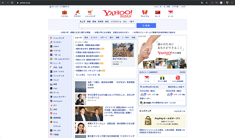
(Source: Yahoo Japan 2019)
You may ask why that is. In our previous article, we reveal that Japanese people seek information by reading text, showing why Japanese websites have more content and typography. As you can see in the image above, Japan’s interface provides a sectioned framework, where more information can be browsed all on one page. To separate the typography and guide users, icons and symbols are used to bring attention to the categories list on the side and on top.

(Source: Yahoo USA 2019)
On the other hand, the layout for Yahoo! in America utilizes white space in an attempt to separate sections of information from one another. This strategy employs varying scales of information through imagery and limited typography because Americans have short reading attention spans. Looking at the image above, the use of the brand’s purple-colored typography visually contrasts with the imagery and white background to guide the users to view the categories list on top.
By localizing the content to accommodate the respective users’ learned hierarchy of information, Yahoo! is able to successfully help the user achieve the same goal using different design layouts.
Navigation
The hierarchy of a website is also strongly tied to navigation. The navigation is generally the top bar that takes users where they want to go and generally helps users find the information that they’re seeking in an app or website. It needs to be intuitive and clear for all users. It is one of the most important interactions there is because it manipulates and sets the pace of the user journey. If the navigation is not routed correctly, the user won’t be able to find the page they are looking for, which disrupts the user flow and creates a negative user experience.
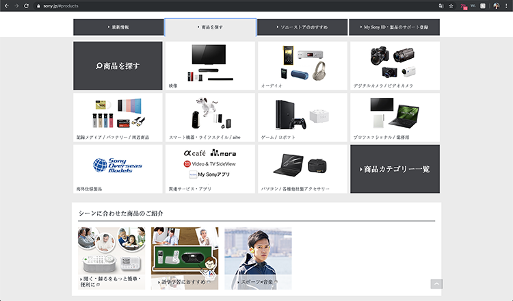
For example, we will compare the user journey when searching for specific products on Sony’s American and Japanese websites.
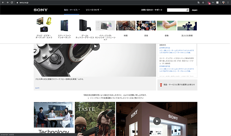
(Source: SONY Japan 2019)
(Source: SONY Japan 2019)
On Sony Japan’s website, the tab bar groups together “Products” and “Services” into one option (“Products/Services”). When clicking into the “Products/Service” option on the drop-down menu, the navigation bar expands into various categories, such as “Movies” or “Gaming & Network Service”. The search goes from a general search to a more specific search on each page and sets the pace of searching for specific products.
By laying out the hierarchy in sections, it gives Japanese users more context about the page options, leading the user to their desired product after clicking through more pages. This use of the holistic approach gives the users more context, such as the latest information on products and recommendations for similar items.
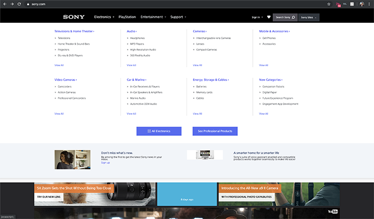
(Source: SONY USA 2019)
On the other hand, Sony USA uses the analytical design approach and focuses on the specific needs of users by laying out all the categories and listing out all the departments under their respective categories first. The categories are laid out to streamline the process and save time, unlike Sony Japan’s design of laying out information on multiple screens. Americans typically want to utilize the least amount of time to find what they need and therefore the navigation needs to be as efficient and intuitive to keep up with that pace.
Platforms
When looking at design differences, consider different platforms and how each is intended to engage with the audience.
Japan is a mobile-first country when it comes to accessing the web. Years ago, it was expensive to create both mobile and desktop versions of a website, so Japanese companies chose between the two and settled for what the majority of users were drawn to: mobile-friendly websites. Thus, companies optimized the Japanese UI design of their sites for mobile. Nowadays, more and more Japanese websites are finding it important to incorporate more fluidity between mobile and desktop because it targets more users to access their websites and also to become multi-platform compatible.
On the other hand, American customers desire seamless experiences when it comes to consuming content, from mobile phones to tablets to computers. With most US websites, the user interface and user experience design are made to be responsive, whether accessing from desktop or mobile.
Considering how to design the user journeys for Japan and America on each medium, whether it be on mobile or desktop, is crucial to creating great user experiences. Besides, building websites that seamlessly transition on multiple platforms is easier than ever with website building sites, such as Squarespace and Wix, to create easy and impactful experiences.
Conclusion
The goal of localizing the UX design of American and Japanese websites is to give users the same overall experience despite cultural differences. Five of the most important aspects to consider when localizing design includes color psychology, typography, hierarchy, navigation, and platforms.
Purely translating content and using the same interface design may not work as effectively if your target audience has already gathered learned experiences from their surroundings, such as what to expect from the navigation bar or how colors are portrayed. Therefore, taking into account cultural context is vital to creating a successful user experience. As the saying goes, “When in Rome, Do as the Romans do.”
#####
Are you looking to expand your business in the Japanese market? We at btrax specialize in UX localization and marketing in the Japanese market. Take a look at our services to see how we can help you succeed in the Japanese market. Contact us with any questions and we look forward to hearing from you!
Did you enjoy this article? Subscribe to our newsletter to be updated on our latest articles, news in Japan, and more.
Edit by: Julie Saephan


