Btrax Design Company > Freshtrax > What American D...
What American D2C Brands have for Effective UX and Japanese Brands Don’t
The online store has become an indispensable sales channel for every business, and one could even say it is becoming a mainstay sales channel as opposed to a sub-channel.
Because of this trend, brands are constantly working to optimize their customers’ purchasing experiences in their online stores.
With this, we’ll feature some US Direct to Consumer (D2C) brands’ websites. D2C brands carry out everything from manufacturing to sales themselves, thereby cutting out middlemen, allowing them to deliver more affordable and higher quality products that meet consumers’ specific needs.
Most of these brands garner lots of attention by offering a purchasing experience centered around online stores. Customer touchpoints with these brands range from social media and online advertisements to newsletters and websites, among which the online store is the last step leading to sales, and so it is indeed an important channel.
Online D2C brand stores are increasing their presence and offering items that cannot be sold in brick-and-mortar stores, so it’s clear this business structure was designed to centralize around the user and their online experience. Let’s take a look at a few characteristics that make D2C Brands so successful.
American D2C Brand Website UI/UX Characteristics
1. Well-Balanced Brand Recognition and Promotional Content
Many D2C brand websites have a well-balanced distribution of promotional information to branded content, a point that is easily noticeable from their homepages. Among these brands, there are many that handle products in a very high-quality manner using the latest technology, and usually they appeal to customers searching for that specific product quality and brand value.
In fact, many D2C brand sites have excellent purchasing experiences all while communicating brand appeal, which is certainly intentional considering how these brands adopt business models and pricing strategies conscious of scalability.
In order to illustrate these points more clearly, let’s introduce a few examples.
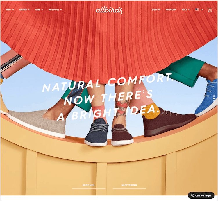
Allbirds, a shoe brand made from sustainable and functional New Zealand wool, is a familiar D2C brand to many. Their main visual first conveys the brand image, showcasing that they are wool shoes that can be worn with bare feet or are a comfortable and breathable footwear option.
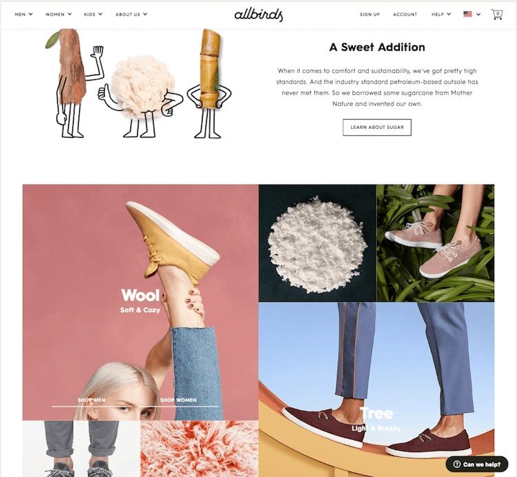
In addition to this, there is a “Shop X” CTA button in the section displaying Wool and Tree shoe models that acts as a shortcut to the shopping basket. In this way, though Allbirds doesn’t have many different products, they have these buttons that encourage purchasing behavior.
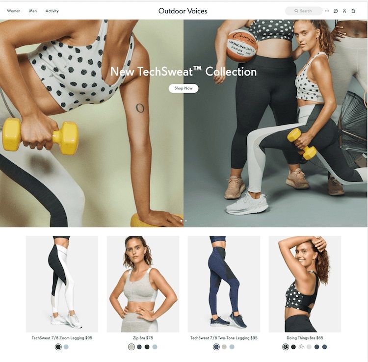
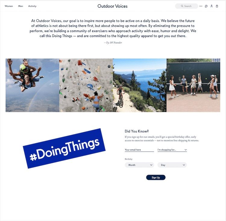
The fitness clothing brand Outdoor Voices also balances between branding and promotion well. The latest campaigns are placed at the top of the home page because new products are optimal for attracting new customers and piquing the interest of existing customers, thereby leading to sales.
Below that, they display a more detailed list of products so the potential customer remains interested in moving towards making a purchase, a design that also encourages purchasing behavior.
 After the promotional content is a section that explains more about the brand.
The founder’s message is displayed in this section as well as user-generated content on Instagram in order to communicate the brand’s value proposition and voice which focuses less on increasing sales and more on drawing attention to the brand.
The Outdoor Voices founder’s message spells out their goal of inspiring more people to become active every day, and successfully does so in a way that conveys the brand’s core values without sounding too corporate and detached. Here the brand establishes what they value and as they build a relationship with customers (through the content tone), which helps to empathize with the user.
In major brands, by contrast, we can see they don’t usually display founder’s messages on the homepage, but rather just show their products.
2. Communicating More with Less: Simple Design
For D2C brands founded without a physical store, websites and social media are naturally their primary media for sharing messages. Young brands especially want to convey detailed information on what kind of brand they are and why their products or services are superior.
But it’s not just about having more information. A lot of D2C brands deploy clever UI/UX techniques to create more user-friendly experiences and deliver the right amount of information in digestible quantities.
For example, subscription brands often show explanations about the structure and benefits of their subscription service, but instead of confusing the user with huge amounts of text, they use icons and animations, sometimes adding humor as well.
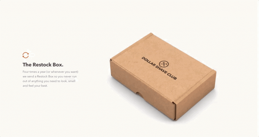 Example of Dollar Shave Club’s men’s subscription service explanation.
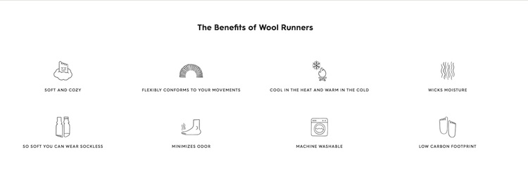
Allbirds summarizes the functions and features of their products comprehensively through icons and light text descriptions, and smiley faces and gentle lines help convey the brand’s image of comfort.
Of course there is only so much that can be communicated through visuals, and so there are also dedicated pages where brands explain their manufacturing processes and the materials that are used, separately. This information is not displayed outright by default. Such detailed information is displayed on a clickable area so the details are delivered to only the people seeking the information when they choose to see it without hindering the experience of those who do not need it.
3. A Substantial About Page
The majority of D2C brands don’t pack all their information on the homepage or product page so that these front-facing pages are clearly and immediately understandable. However, most D2C brands are born from a desire to solve everyday problems, so they should tell detailed stories about their brand identity and philosophy to empathize with those who have the same problems.
Users, particularly millennials, also expect social responsibility from brands now more than ever and will support brands based on their behavior in that regard. According to Nielsen, the global measurement and data analytics company, 50% of survey respondents willing to pay more for an item said they were influenced by key sustainability factors.
D2C brand About pages ranges from company value statements to blog-like content. In fact, some content is so comprehensive that there are sometimes blogs separate from the About page that is oftentimes sufficient as its own medium.
Reformation, the famous sustainable apparel brand, has great price transparency and an About page that discloses a plethora of information on things like product raw materials, manufacturers, sustainability efforts, reports on labor environments, and so on.
Ritual, a medicinal vitamin D2C brand founded to deliver healthy vitamins, has a blog page on vitamins and nutrition that’s linked to the online store which serves to eliminate suspicion around vitamin preparation.
The About page is no longer just a place to share corporate founding philosophies or history.
Japanese D2C Brands Based on American Brands’ UI/UX Characteristics
After making these D2C brand website features clear, it’s time to take a look next at Japanese D2C brand sites to see if these features were utilized. There are not many D2C brands in Japan, and those that are there are primarily apparel brands.
Rather, we’ll focus on FABRIC TOKYO, RiLi STORE, and STYLE DELI, which are trending as D2C brands in Japan right now, and we’ll compare these brands with the characteristics highlighted in the previous section to see what they have in common.
FABRIC TOKYO: The Only One to Apply Them All
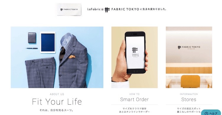
FABRIC TOKYO is a made-to-order men’s clothing brand that selects their own raw materials with sustainability in mind and is an advanced D2C brand in Japan. We can see that their website is similar to US D2C brands in a lot of ways.
1. Balance Between Brand Recognition and Promotion
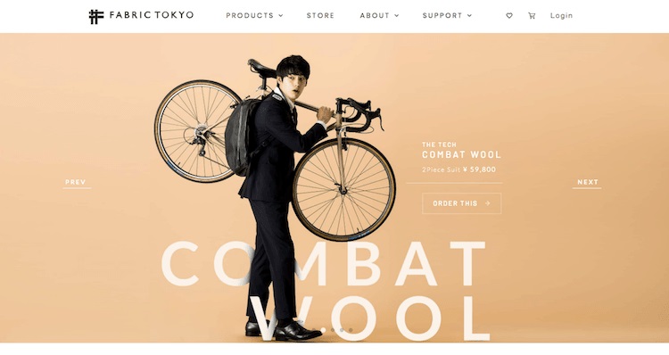
At the top of the homepage is an introduction to the latest seasonal collection, after which there is a section linking to the About page, but not a lot of content introducing the brand up front. The product listings are clear and not so busy, and you can tell there is care put into the little amounts of direct promotion they do.
2. Communicating More with Less: Simple Design
Icons are used both on the product details page and on the page explaining their manufacturing process to prevent information overload. Whenever a brand wants to explain a lot on a particular point, that’s precisely the time to consider using simple designs and iconography for that explanation to make it easy on the user.
3. A Substantial About Page
FABRIC TOKYO’s about page was the best out of the three because they show their company philosophy, manufacturing process, introduced their smart ordering system, and showed fabric details. On the blog, the content wasn’t focused on merely selling FABRIC TOKYO’s suit, but about how to dress like oneself in a suit or jacket.
Not only does this brand sell quality products in a convenient way, but their website and communication strategy was very refined and felt a lot like an American D2C brand.
The Other Two: RiLi STORE and STYLE DELI Were Completely Japanese
The remaining two stores didn’t have many features that resembled American D2C brands.
The first one, RiLi STORE, began as a fashion media brand popular amongst women in their teens and early twenties who resonate with instagenic products and images.
The website layout is similar to a shoppable news feed on Instagram, and perhaps it was a difference in the brand value, but one could hardly find a description explaining what the brand is exactly.
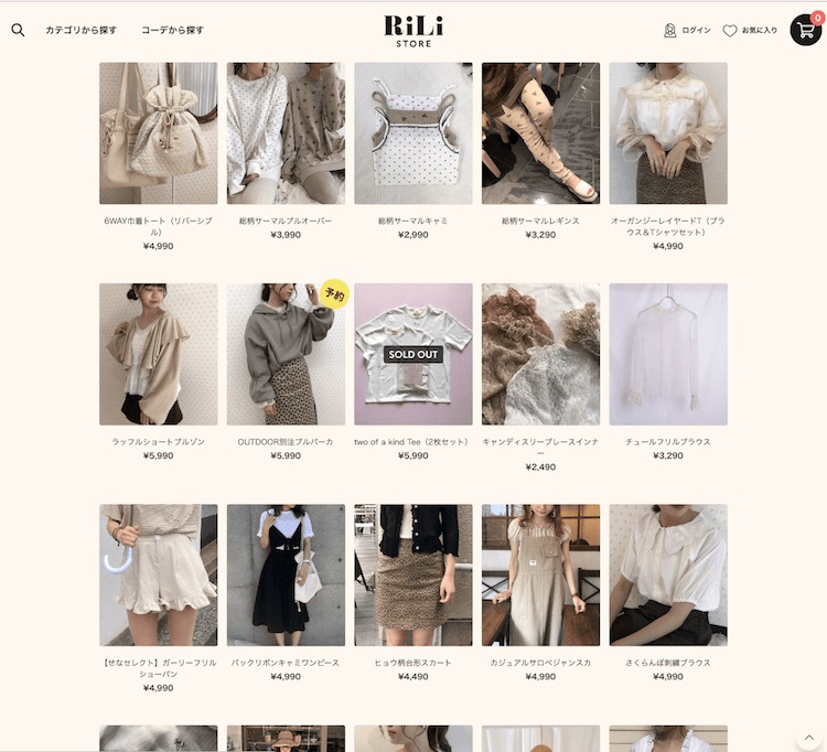 RiLi STORE’s product overview homepage. Source: RiLi STORE website.
On the other hand, STYLE DELI, which is gaining popularity among women in their thirties and forties with its high-quality products at a reasonable price, has applied some of the aforementioned D2C characteristics. The brand message is clearly written, and there are Q&A bulletin boards that allow its blog users to ask questions and view content to find the best shoes.
But users are left with the impression that the blog, staff product review tone, and Q&A used the latest UI/UX trends.
There are also too many items displayed on the homepage, with more than 5 from almost every category including new products, tops, and more. There aren’t a lot of elements that exhibit the important aforementioned points that strong D2C brands have such as contents about brand or brand value.
The main thing is how there is a lot of information on the pages and the number of items shown at one time is extensive, with product pages packed with information. Are these features unique to Japan?
This leads to another point that our CEO, Brandon Hill, mentioned in his recent talk in San Francisco on designing UX features for Japanese consumers. He talks about how there is generally a lot of text on each page, and even on street signs, magazine covers, and so on. Yahoo! JAPAN, and Rakuten, are good examples of this kind of UX on websites.
Although it may seem hard to understand because of all the information all at once, this kind of busy UI is common, and Japanese users are accustomed to finding what they need despite the density of information, and it can be considered calming to have so much material just in case it’s needed.
Conclusion
Looking at the characteristics of American D2C brand websites in this article, and though people may hold different opinions, rarely are American D2C brand sites not beautifully designed or have a social media ad that wasn’t attractive.
They all share unifying characteristics that result in user-centered design.
The first feature is that they balance well between brand recognition and promotion which is proving to be effective since 84% of millennials are not engaged by traditional advertising, according to a leading survey by The McCarthy Group. The second feature is incorporating a design that users can easily understand.
Finally, the third point is matching the growing need of millennials to sympathize with brands’ identities and choose them, in part due to the tendency for D2C brands to address important issues or conduct business in a socially responsible manner.
On the other hand, the fact that Japan’s D2C brands don’t have these features is completely natural: if the main user changes, the UX must change too, but what matters is whether the UX is best for the current user. However, some of the features discussed would be very useful for improving the UI/UX of Japanese D2C brands in the future.
btrax conducts global expansion consulting to D2C brands based on user insights and is able to consistently support a marketing strategy for brand recognition including website building and promotional activities for user acquisition. If you are interested, please do not hesitate to contact us.
(Written by Yasuko Katsumata; Translated by Ash Hill)


