
Btrax Design Company > Freshtrax > What the Attent...
What the Attention Economy Has Done to UX Design
Looking back over the last 100 years, you’ll notice just how much change there has been in top American companies. The infographic below reveals how in 1917, top companies’ main products were oil, steel, and other material goods. Today the top enterprises don’t specialize in physical goods, rather they are IT companies that trade in data.
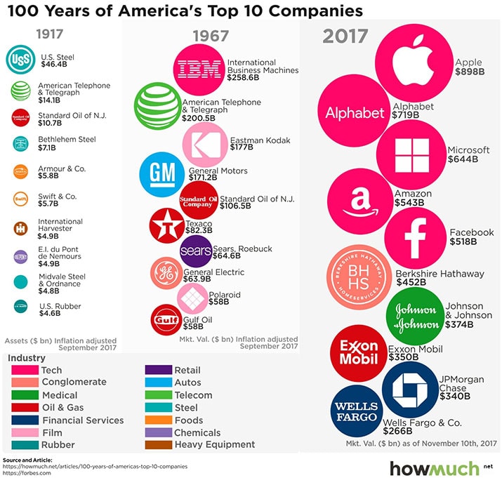
Taken from: https://howmuch.net/articles/100-years-of-americas-top-10-companies
With oil, the price increases because of finite resources (or with a lack of confidence in its availability), thus driving up the cost of gas, airline tickets, and the like. Over the past 100 years, we have moved from the physical economy to a new kind of economy. IT companies operate in a society where information and data are in excess, so what is the resource that they are mining? The answer is our attention.
The explosion in the amount of data gathered on users of IT products and services lately is at the core of what’s called the attention economy. Let’s take a closer look at the concept and what it’s all about
What is the attention economy?
According to one theory, the concept was proposed by Herbert Simon, an American economist and political scientist. He defines it as follows:
“…in an information-rich world, the wealth of information means a dearth of something else: a scarcity of whatever it is that information consumes. What information consumes is rather obvious: it consumes the attention of its recipients. Hence a wealth of information creates a poverty of attention and a need to allocate that attention efficiently among the overabundance of information sources that might consume it”
Source: Simon 1971, pp. 40–41
Let’s take a look at some of the platforms designed to capture our attention.
Everyone’s on Facebook these days, but even their emails are designed for engagement too. If you are tagged and have notifications on, you can receive an email telling you that your friend tagged you in a photo, and there is a link that allows you to instantly see that photo for example. This kind of design constantly tempts us and draws us back to their platform. Some features are even designed down to the pixel.
We get curious about what kind of photo we were tagged in, how we look, how it came out and so on, and then are teased back to the platform. And once we’re there it doesn’t stop with one photo. We look at our feeds, other photos, etc. Haven’t you ever had the experience of losing track of just how much time you spent on Facebook?
That’s the power that Facebook and other companies have over our attention. Facebook is designed to keep our attention. Many companies are focused on having active users spend long amounts of time on their platforms and Facebook is succeeding tremendously at it.
This kind of attention grabbing design isn’t limited to Facebook. Let’s examine the business-focused social media platform, LinkedIn, to illustrate how they are utilizing the attention economy as well.
LinkedIn sends user notifications, but of a different kind than Facebook. Users want to be notified when a company they want to work at is hiring, for example. But that’s not enough to hold a user’s attention, so they also notify them when someone they know reaches a work anniversary and a call to action, for example “Congratulate Riley for his 3 month anniversary at btrax”. Both Facebook and LinkedIn use these kinds of notifications and are good examples of what some have termed “dark patterns”. Dark patterns are essentially when a company chooses design features to meet business goals rather than user needs. They are designed to deceive and coerce the user to action and interaction, rather than be a useful and important notification.
Further reading: https://trydesignlab.com/blog/are-notifications-a-dark-pattern-ux-ui/
Snapchat
Another platform that uses a ground-breaking design to keep users’ attention is Snapchat. They have “communication streaks”, which show your friends how many consecutive days you’ve been using the app, i.e. through chatting and snapping. People don’t want to lose their streak, so even if they have no reason to, they will send messages to keep it going. This is the essence of the gamification of UX, to capitalize on people’s desire for progress and achievements.
We have to wonder if the way people are interacting on snapchat is out of a genuine desire to connect and deepen their relationships with others, or if they’re under the control of an ingeniously designed system that holds their attention and engagement so effectively.
I have to wonder if we’re truly able to control the amount of time we spend on different platforms or not.
Our Dependency on Technology Drives the Attention Economy
Millennials are different from previous generations in that they don’t exercise as much, and they are more dependent on technology, playing lots of games and using their smartphones.
There’s research into the way that slot machine addictions operate in people. These machines are built based on BF Skinner’s behaviorism theory. Imagine a box with a rat in it and a button that when pressed administers food to the rat but the amount given is randomized. Because of this randomization, the rat pushes it more out of curiosity to understand the amount received per push than out of necessity.
The rat starts to push the button even when it doesn’t need to eat anymore. Because slot machines are based on this Skinner Box design, many people have become addicted. This style of design is implemented on social media platforms and other services.
In apps like Gmail and Facebook, the pull-to-refresh feature is especially addictive, causing users to pull down constantly even if its unlikely there will be a new email or post. This makes it irresistible to keep refreshing even when notifications don’t come. The infinite scroll on apps like Instagram is another example of a dangerously addicting UX feature.
We can see how behaviorist models go into UX features of certain platforms, designed to draw us in and desperately harvest our attention. We’re in the age of ubiquitous technology with the ability to have any information we want in the palm of our hands at a moment’s notice. Although there are emerging discussions and suggestions on healthy improvements to social media UX, It seems we are controlled by technology, not the other way around.
Problems That Arose through the Rise of the Attention Economy
What sorts of problems do you think might come from the rise in the attention economy?
- Being distracted and pulled away from life and work
- Losing the time to consider things more carefully, thereby hindering innovation and creativity
- Depression and technological dependency
- Feelings of isolation
- Infringement on people’s ability to make willful choices
UX That Respects People’s Autonomy
Technology is amazing, but it shouldn’t control people’s lives, rather it should enhance their ability to make their own decisions and avoid distractions, especially at critical times.
Apple came out with an iOS update at the beginning of this year that stops notifications from coming at certain times, while driving for example, in order to respect the user’s space and safety. It can detect when you are driving and mute notifications accordingly because as we all know, when notifications come we tend to read or glance at them even when we don’t mean to or shouldn’t.
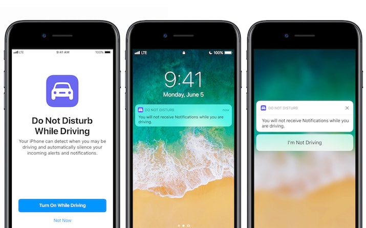
Source: Apple, Inc.
There have been many accidents caused by distracted drivers in recent years, so this iOS update was a great response to the problem. You can even set automatic messages to be sent to people who message you as a quick and safe canned response that lets them know you’ll get back to them.
Hipmunk
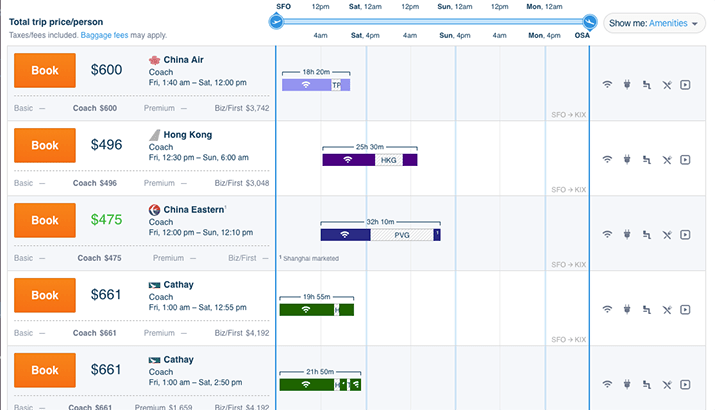
Another service doing interesting things with their users in mind is Hipmunk. It’s a platform that lets travelers pick flights by price and duration, but they have an additional filter option: agony.
Essentially, agony is defined by Hipmunk as total flight time, number of transfers, price, and other customer pain points.

The site is designed so you can understand the entire itinerary in a single look too. Users aren’t searching for price or duration, but rather price and duration among other things, so from a UX standpoint it’s a dream come true.
Conclusion
The attention economy is not a new concept. But lately it has become a buzzword in regards to the negative impact that the human-technology relationship can have. And in the internet age where information is readily available at our fingertip at all times, companies are vying to grab our attention any way they can. Of course there are many services that focus on quick user acquisition, but that’s not the kind of service that lasts over the long-term like the above examples of Apple and Hipmunk. Those respect users’ autonomy, desires, safety, and experience, making them enticing and enjoyable. In other words, if you want to keep users for the long term, you won’t do it by grabbing their attention at every turn, but rather you’ll succeed by putting human-centered UX design first.

