Btrax Design Company > Freshtrax > The Psychology ...
The Psychology of Color: Why It Shapes How We Think, Feel, and Act
We’re surrounded by color every day, but how often do we stop to ask why a particular color was chosen for the thing in front of us? Color affects the way our minds work far more than most of us realize.
Everything we use was designed by someone, and that someone made a color choice. We experience the result as design, but the person behind it was usually working from color psychology, choosing a palette meant to trigger a specific response.
Understanding how that works means you can use color deliberately, whether that’s in a brand, a product, or even how you dress for the day.
How color affects us
Color doesn’t just look nice. It works on us in four distinct ways.
Psychologically, color tends to support memory, recall, and recognition. It’s one of the quickest ways to help someone understand, learn, or be guided toward something.
Physiologically, color is thought to act on the nervous system. Bright red is often said to stimulate the sympathetic nervous system and raise blood pressure, while blue and green are associated with relaxation.
Emotionally, color shapes mood more than we tend to give it credit for. Yellow tends to lift people’s spirits. A houseplant’s green tends to put people at ease.
Culturally, the meaning of a color is never universal. In Western cultures, black is associated with death and mourning. In many East Asian cultures, that role belongs to white instead. Design carries cultural meaning, and it is read differently depending on who is looking.
What each color communicates
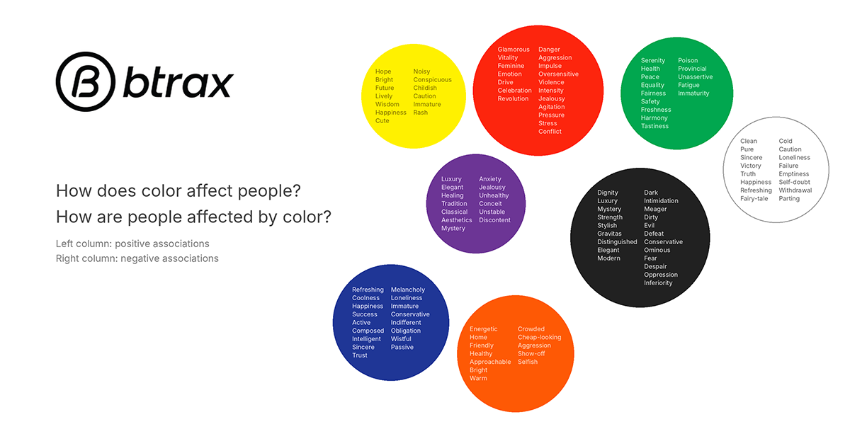
Color is physically the same everywhere, but the psychological response to it shifts by culture. Paying attention to both the physical and the psychological response is what makes a color choice work.
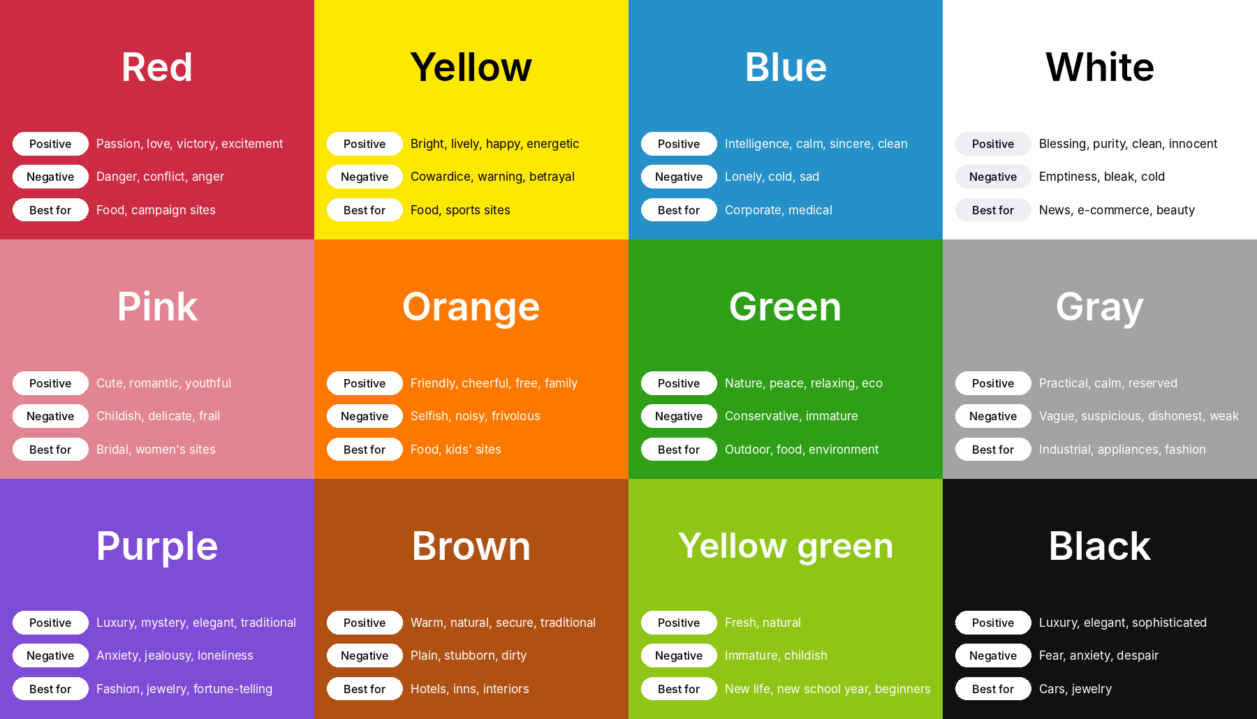
Red signals alertness and urgency, and stirs excitement. It has the longest wavelength of any visible color, and it is often said to raise body temperature, blood pressure, and heart rate.
Orange feels optimistic and upbeat. It is associated with appetite and energy.
Yellow projects brightness and hope. It is associated with alertness, focus, and quick thinking.
Green brings emotional stability and a sense of calm. It is closely associated with healing, and is often said to ease muscle tension and lower blood pressure.
Blue delivers a feeling of clarity and composure. It tends to feel calming, and is often said to have a soothing effect on the body as well.
Purple reads as refined and elegant. It tends to feel calming while sharpening focus.
Black projects strength and prestige. It can also read as intimidating, which is part of why it signals power.
White communicates purity and innocence. It’s the color most associated with a clean slate, a fresh start.
The details you don’t consciously notice
Color psychology isn’t limited to the colors themselves. It also covers how colors behave relative to each other, and most of these effects go unnoticed even as they shape how we react.
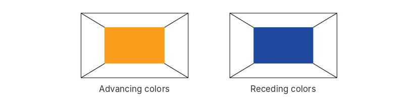
Warm colors like red, orange, and yellow feel warmer than cool colors like blue and blue-green, even at the same temperature. Warm colors are also “advancing”: they seem to come forward. Cool colors like blue, blue-green, and blue-violet are “receding”: they seem to sit further back on the same flat surface.
Brightness changes how big a color looks. A white shirt looks bigger than an identical black one because of how our eyes read lightness, not because it is bigger. Lighter, higher-value colors look expanding, and darker, lower-value colors look contracting.

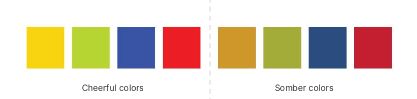
Colors with high saturation and high brightness, usually warm ones, read as cheerful. Colors with low saturation and low brightness, usually cool ones, read as somber.
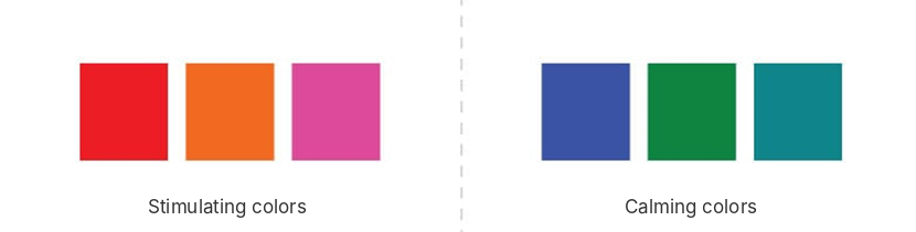
Red-leaning colors with high saturation and brightness feel stimulating. Blue-leaning colors with low saturation and brightness feel calming.
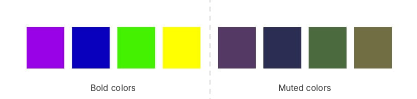
Vivid, saturated colors look bold, and pale, desaturated colors look muted.
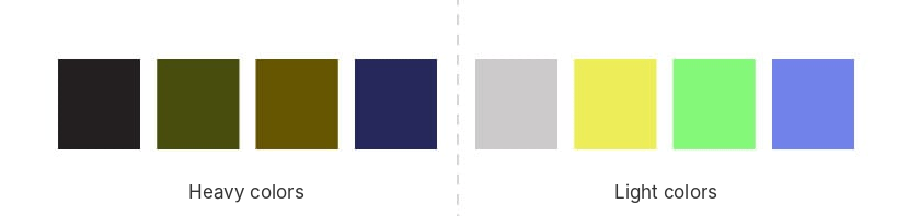
Colors with low brightness feel heavy, and colors with high brightness feel light.
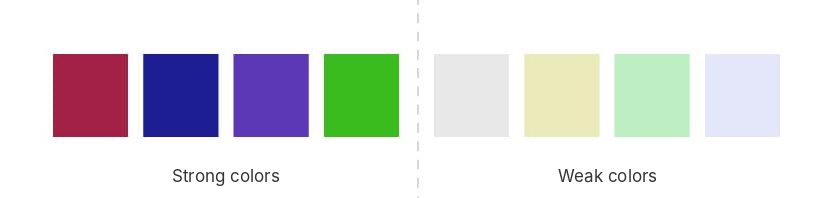
Deeply saturated colors feel strong, and pastel, washed-out colors feel weak.
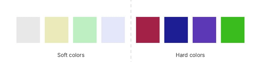
Brightness also affects how soft a color feels: high-brightness colors look soft, and low-brightness colors look hard.
One often-cited example involves a classroom: after the walls were repainted from orange to blue, the children reportedly became calmer and more attentive. A stressful background color may also shorten how long people stay on a web page.
We take in most of this through our eyes without ever consciously registering it, and it shapes how we feel anyway.
How color quietly directs behavior
Color doesn’t only communicate. It also nudges behavior, which is why it shows up everywhere from interior spaces to advertising to fashion, and why the response tends to feel intuitive rather than something we were told to feel.
The clearest everyday example is signage. A traffic light manages entire intersections just by cycling through red, yellow, and green. In places like airports, where confusion has real consequences, black and yellow get paired specifically because that combination is nearly impossible to miss.
Color also does real work in how people read us personally. Wear black to a negotiation and you read as sharp and self-possessed, which is the impression you want going into that kind of conversation. White reads as sincere and polished, which makes it a strong choice the first time you meet someone. Blue reads as steady and composed, which is part of why it’s such a common choice for interviews.
What you wear affects you too, not just the people looking at you. Red is a stimulating color, and wearing it tends to make people feel more motivated and ready to act. Wearing your own favorite color also tends to feel comforting. And in food photography, editors typically brighten the overall image and pull back the green and blue tones to make the reds pop, because that reads as appetizing on camera.
Same color, different meaning
The meaning of a color also changes from country to country. The chart below shows how blue, green, red, and yellow are interpreted in five countries. Treat these as examples rather than rules: the red that signals good luck in China is associated with death in Egypt, and a color that works in one market can send a different message in another. 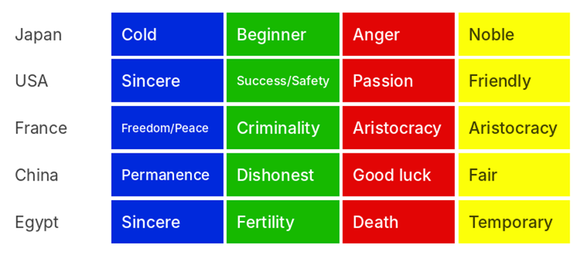
The takeaway
Most people register color as just color. But it’s shaping how we think and feel far more than we realize. Once you understand what a given hue tends to do, a lot of design choices, in branding, in a logo, even in your own closet, suddenly make a lot more sense. The clothes you reach for on a given morning are often a color your mood picked out for you before you consciously thought about it.
Color isn’t something you read like text. You feel it, which is why most of its influence happens below the surface. It’s worth paying a little more attention to the colors around you and noticing what they’re doing to you.
Understanding what a color does to your audience is one thing. Building it into a brand, a product, or a user experience that actually connects across cultures is another. If you’re thinking about how color, and the rest of your design, should shift for a new market, btrax can help you figure out what to change and why.
Japan GTM for AI Startups
Build trust, connect with decision-makers, and accelerate your Japan market entry through events, community, and localized GTM execution.

New articles