Btrax Design Company > Freshtrax > Inde Look at bt...
Inside Look at btrax’s Website Redesign
Curious about what goes into a full-scale website redesign?
In this article, you’ll hear directly from the key team members who led the transformation of btrax’s digital presence. Discover how the rebranding initiative aligns with a bold new brand identity, embracing the future of design while unifying teams across San Francisco and Tokyo. Learn about the biggest challenges, innovative solutions, and the vision that guided the project.

From vibrant colors to playful interactivity, the new design reflects btrax’s evolving identity and commitment to creativity. If you’re interested in balancing aesthetics with functionality while pushing the boundaries of design, this article is for you.

What was the main reason for redesigning the website?
Brandon Hill (Founder and CEO of btrax): The website redesign is part of our overall rebranding initiative. We wanted to align with societal changes driven by technology, especially AI, and unify our teams in San Francisco and Tokyo with a more universal brand identity.
Jared Javier (Associate UX/UI Designer at btrax): We needed to keep the website up-to-date to better connect with our current audience and attract new visitors. Our team is young and energetic, and the new design expresses who we are and how we’re evolving.
Suzuka Ito (Associate UX/UI Designer at btrax): Our services have expanded beyond just creative support, and we felt it was necessary to update the website to reflect the boldness and impact of the direction our company is heading.

What were the biggest challenges you faced during the redesign?
Brandon Hill: One of the biggest challenges was using vivid colors while maintaining text legibility. We wanted brighter tones to reflect our culture, but making the design both visually appealing and readable wasn’t easy.
Jared Javier: We initially leaned towards a more artistic design, but after user testing, we realized that functionality needed more focus. Balancing aesthetics and usability was tough.
Suzuka Ito: Managing time and resources was challenging since we were learning the no-code tool Framer on the go. I enjoyed working on the web design itself despite some roadblocks.
How does the new design reflect btrax’s brand identity?
Brandon Hill: The theme of the new design is ‘dynamic yet smooth.’ We wanted the website to feel playful yet elegant, this is reflected in the interactive elements and overall design.
Suzuka Ito: We moved away from neutral, clean aesthetics and adopted a bolder color palette and typography to communicate confidence and creativity, which aligns with our brand’s evolution.
Hironori Aihara: We focused on making a strong first impression with large images, rounded corners, and a reel video at the beginning. These elements give off a modern, progressive image.
How did user feedback influence the design?
Jared Javier: User testing helped us shift from a more artistic website to something more functional. We added clear calls-to-action (CTAs), hover interactions, and improved the layout to make it more user-friendly.
Suzuka Ito: We incorporated more interactive elements to create a fun, engaging experience. The goal was to visually delight users without compromising usability.

What are the most significant visual changes in the redesign?
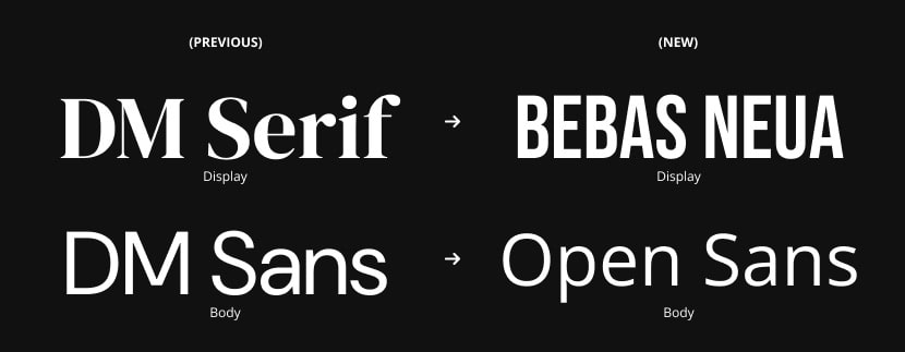
Jared Javier: We introduced brighter colors and updated the typography with a condensed sans-serif font for a modern feel. It’s more lively and engaging now.
Suzuka Ito: The color palette is much bolder, and the typography communicates confidence and innovation, matching our new brand identity.
Hironori Aihara: Using large images with rounded corners and a reel video at the start gives our new website a progressive, modern feel. We made the visuals as bold as possible without being too noisy.
What do you hope visitors will take away from the new website?
Brandon Hill: We focused on reducing unnecessary text and letting visuals and interactions tell our story. I hope visitors will sense who we are through our design.
Jared Javier: I hope visitors feel that we’re a forward-thinking company that understands their needs and stays on top of design trends.
Suzuka Ito: We want visitors to enjoy exploring the site. The bold visuals and interactive features are meant to engage them, and we’re eager to hear their feedback as we continue improving.
The btrax website redesign embodies the company’s dynamic evolution, seamlessly blending striking aesthetics with user-friendly functionality.
This fresh digital presence not only showcases btrax’s commitment to creativity and innovation but also invites users into an engaging experience that reflects the essence of the brand. As we continue to grow and adapt, we are excited to see how our new website enhances connections with our audience and drives future success.


