Btrax Design Company > Freshtrax > Understanding J...
Understanding Japanese Type Classifications
Font choice is one of the most important factors that go into great design. By utilizing the right font, a design can evoke powerful emotions and feelings.
Developing a rich understanding of font classifications and how they are perceived by different audiences and cultures is crucial for effective typography and the overall aesthetic of a design.
Just like Western typography, Japanese fonts can also be categorized and used to convey vastly different tones. Let’s go through the five most common type classifications: Mincho, Gothic, Round Gothic, Calligraphy, and Display.
明朝体 (Mincho)
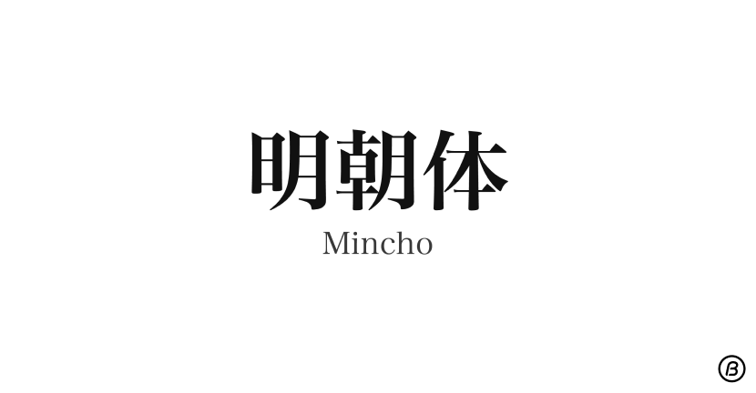
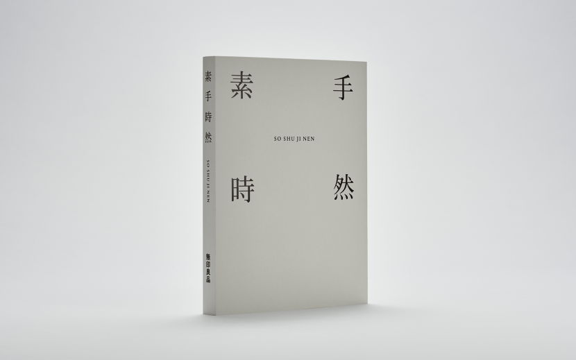
Mincho is equivalent to a serif font in Western typesetting.
Its characteristics include square shapes and relatively small “feet” which are referred to as the “serif.” This font is commonly used for the body text in print media such as books and newspapers.
It gives a traditional and formal impression that can convey feelings of stability and reliability.
Typically, the vertical lines are a bit thinner than the horizontal lines, making it easier to read long paragraphs and suitable for use in body text but also in titles for a classic and serious look.
However, there are many typefaces within the Mincho category of fonts that provide different impressions. For instance, magazines utilize relatively modern Mincho fonts whereas academic books or novels use more traditional ones.
It is such a slight difference, but when you take a closer look, the traditional Mincho is more based on the calligraphic style.
For instance, the character “を” in traditional Mincho has the strokes connected and the one in modern Mincho is not. In addition, the modern Mincho creates a more rectangular or box-like shape.
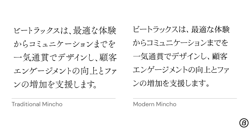
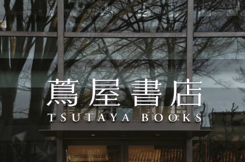
Usage Examples of Mincho font
ゴシック体 (Gothic)
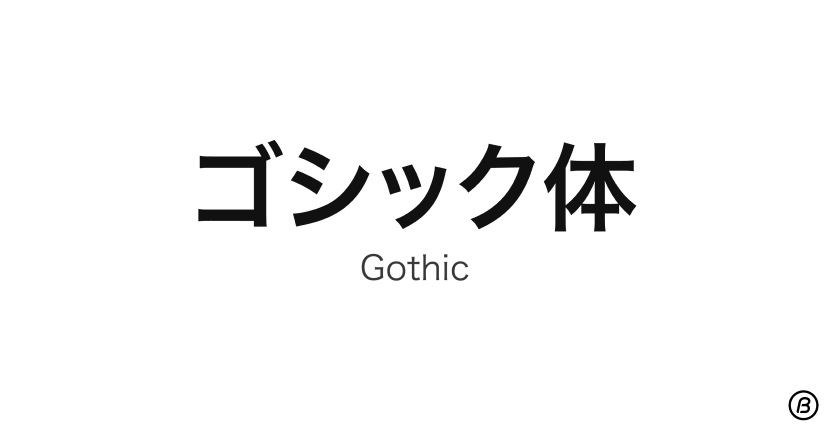
Gothic is similar to sans-serif. Contrary to Mincho, it is more modern, clean, and minimal, lacking the decorative elements of a serif font.
This font is commonly used for headings, but it is also used for body text though this is usually only for casual or contemporary designs.
Just as if there are more varieties of the traditional and modern Mincho within one type classification, different Gothic typefaces can also have different impressions on the reader.
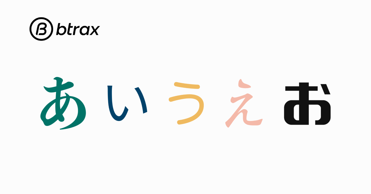
In the image below there is a slight difference between the two Gothic typefaces, the one on the left is more classical and gives warm feelings while the one on the right is more modern and legible and gives off a streamlined impression.
This difference is due to the difference in font size of the Hiragana characters. Having a smaller font size only for Hiragana creates a formal appearance, and having Kanji and Hiragana in almost the same font size makes it look a bit more contemporary.
Learn more about the three types of Japanese writing here.
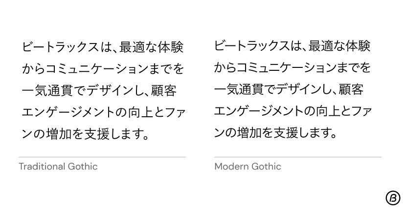
Usage Examples of Gothic font
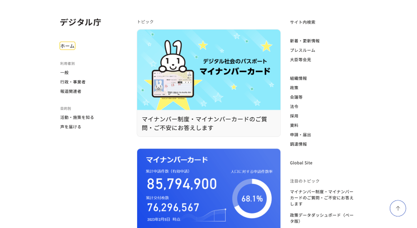
By: デザイン庁
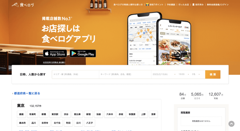
By: 食べログ
丸ゴシック体 (Round Gothic)
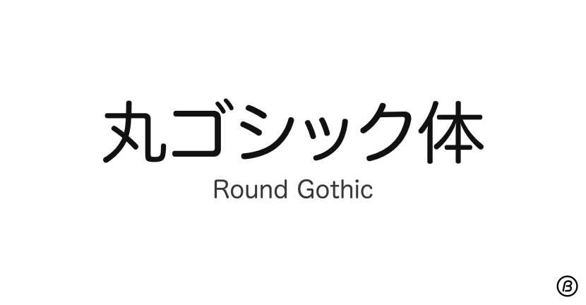
Compared to Gothic, Round Gothic has, as the name suggests, rounded edges and circular shapes, making it look more playful and soft.
It is often used to express friendliness and cuteness so you often find it used in media that are targeting females and/or kids.
However, it may not be so suitable for body typesetting due to its readability. Because of its rounded edges, it may look more overwhelming and be more difficult for readers to quickly distinguish between letters when it’s used for long paragraphs.
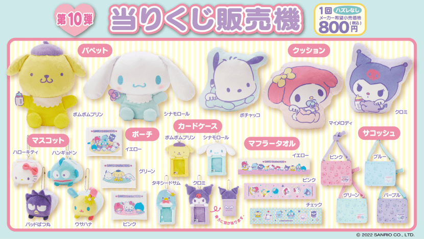
By: サンリオ
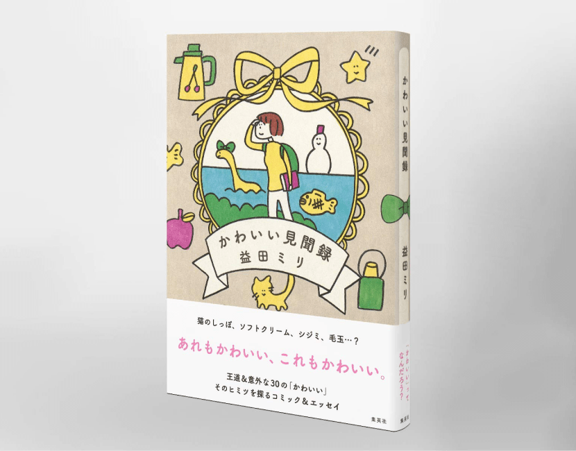
By: 集英社「かわいい見聞禄」
筆書体 (Calligraphy)
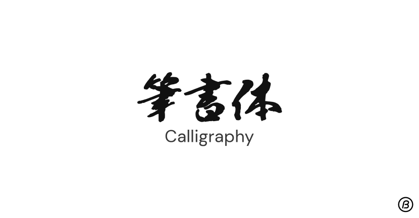
Japanese calligraphy fonts mimic the look of traditional Japanese calligraphy writing, evoking a sense of tradition, cultural heritage, and elegance.
It is used for various purposes and mediums, but commonly to create this Asian-inspired look.
A lot of the time, you find these calligraphy fonts used in Japanese sake, Izakaya signate, Sumo TV channels, or other Japanese traditional places or products.
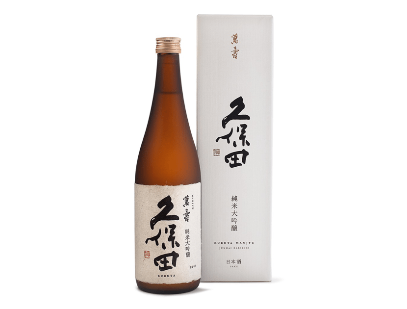
By: 朝日酒造株式会社
デザイン書体 (Display)
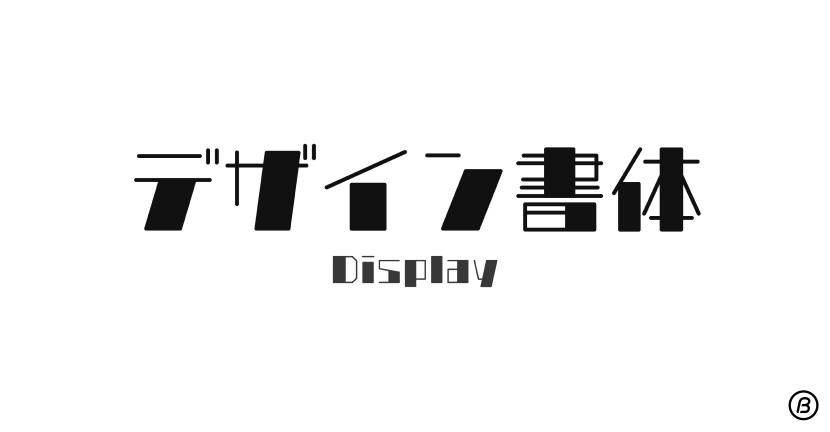
Display fonts are the ones that couldn’t be classified into any of the above.
They are unique and differ from each other and are often used for short pieces of text such as headlines for the purpose of grabbing attention.
Calligraphy can also be categorized into the Display font category, though in Japanese typography, these are commonly expressed as two different classifications.
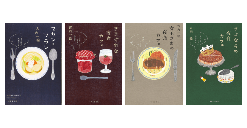
By: 中央公論新社「マカン・マラン」
Conclusion
Japanese typefaces have such a rich history and culture behind them, and they play a vital role in creating visual interest and conveying messages in design projects.
Ranging from traditional Mincho to playful Display fonts, each typeface has its own distinctive features and characteristics that make them more or less suitable for specific uses and purposes.
Although it may be challenging for non-native Japanese designers to understand the different Japanese type classifications, it is crucial to learn these differences to create beautiful designs that effectively target the Japanese market.
Interested in learning more about how btrax helps companies localize content and images for the Japanese market?
Send us an email at sf@btrax.com.
Written by Suzuka Ito, Design Associate at btrax

