Btrax Design Company > Freshtrax > Why do so many ...
Why do so many Japanese brands have letter-based logos? Part 2
Original article: 本当に日本のブランドロゴは文字だらけなのか?
Researching the Top Brand Rankings
Let’s start with a survey of the statistics of the number of logos in Interbrand’s Best Japan Brands 2020 Rankings, including those based on letters, those with symbols and letters, those with letters that look like symbols, and those with only symbols, since these are the “representative” brands of Japan.
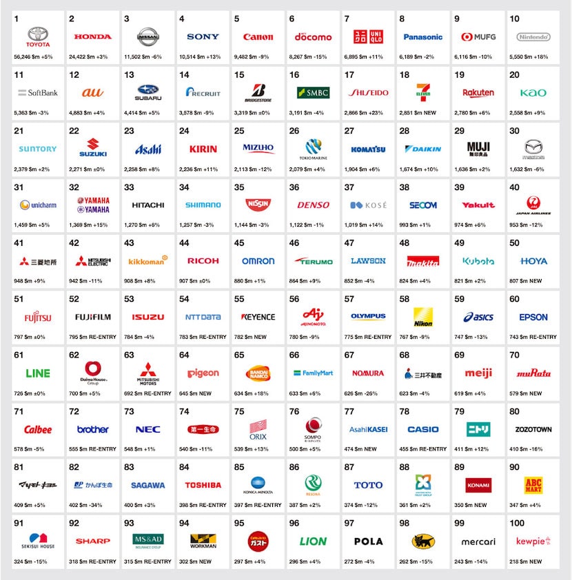
Best Japan Brands 2020 Rankings
- Character-based: 49%
- Character and symbols: 39%
- Symbol-like characters: 11%
- Symbols only: 1%
Typical examples of Character-based logos:
First of all, logotype = a logo in which the text is the main element. 49% of the 100 brands fall into this category, which is almost half of the total.
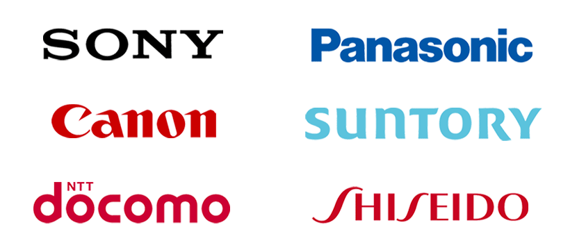
Example of a character-based logo
Typical example of a character and symbol:
Next is a pattern in which both the logo symbol and the logotype are used side by side. Sometimes they are used independently of each other, but the basic rule is that both are used side by side. This is 39% of the total.
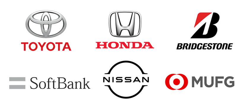
Logo examples of characters and symbols
A typical example of a logo with symbolic text:
Another type of logo is a logo that is basically letters, but arranged in a slightly symbolic way by adding a few design elements. This type of logo accounts for 11% of all logos.
Logo example with symbolic text
Only one that is “only” a symbol
And finally, the type with only symbols and no use of any text elements. This was the only one out of 100. This logo is so world-famous that it is on display at the Museum of Modern Art (MoMA) in New York.
Example of the world-famous Kuroneko logo
Conclusion: There are a lot of text elements
As you can see from the data above, Japanese companies, especially those that have been in business for a long time, tend to use logos with text as the main element.
On the other hand, there are some brands, such as Kuroneko, whose symbol alone is well known around the world.
For example, Ajinomoto recently worked with an American design company to rebrand their logo, changing it from a text-based style to a more symbolic style.

The new Ajinomoto logo is more symbol-centric
Also, if we think in terms of digital channel support, there are more and more cases where icons are becoming more well-known than logos, as in the case of Mercari.
American brands with “only” symbols
Let’s take a look at a typical example of an American brand that uses a logo that eliminates the text element and goes ahead with the symbol alone.
In most cases, they originally used both the letters and the symbol, but when the brand recognition increased, they redesigned the logo without the letters.
Incidentally, there are five American brands out of the top 100 that use only symbolic logos. Therefore, it is not necessarily the case that many American brands use only symbolic logos.
On the other hand, it is interesting to note that top brands such as Apple and Nike have shifted to a symbol-only logo.
With the majority of brands still using either a text-based logo or a symbol + text logo, it would take a lot of determination to go with just a symbol.
American brand logo with only symbols
Reasons for going to symbols only
Let’s consider some of the reasons why people are removing the text elements and going to a symbol-only logo in the first place.
- Confident: Confident that people will recognize the brand name even without the logo text
- Established: Dropped the text element because brand awareness has grown to the point where the symbol alone is recognizable
- Digitally responsive: Chose a symbol that is more visible and fits better on the site and app
- Global in scope: Made it possible for users who cannot read the alphabet to recognize the brand with a single glance.
- Aiming for a universal presence: The brand itself will become more universal by becoming a “symbol” rather than a name.

Examples of universal symbols
The roots of symbolic logos: family crests
Finally, although Japanese brands have few logos that are only symbols, one of the roots of the logo symbol is the “family crest” that has been used in Japan for a long time.
In the past, there were many people who could not read due to their different backgrounds.
Family crests were developed as a symbol that even such people could recognize with one glance. It also served as a banner in warfare to instantly identify friend and foe.
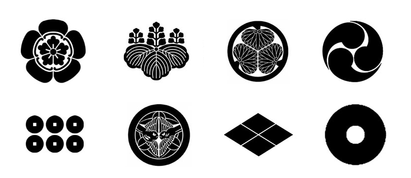
Japanese family crests have influenced brands around the world
This beautiful Japanese family crest has also influenced Louis Vuitton and is the basis of their hologram. The logo of btrax was also inspired by the family crest.
Brand symbolization is a way to respond to digital and global trends
If we consider the future trend of the world and the growth of Japanese companies, it is the right direction to gradually shift from logotype-centered brand logos to symbols.
Considering the fact that in the near future, all companies will have to become technology companies to survive, digitalization and globalization will become important factors in corporate branding.


