Btrax Design Company > Freshtrax > Does ‘pla...
Does ‘plagiarism’ apply to UI and UX?
You may have heard the saying, “Good artists copy, great artists steal.” Picasso said it, Steve Jobs quoted it, and now this notion has become one of the standards in the design world.
Does this mean that imitation is not good, but plagiarizing ideas should be taken for granted?
In the creative world, everyone is influenced by someone else for one reason or another, and 100% originality is quite rare.
There is parody in art, music, logos, and illustrations. But is there “plagiarism” in UI and UX?
What is the difference between UI tracing and plagiarism?
When learning design, the most effective method is to “plagiarize,” or “trace”.
Tracing is where you take the UI or UX of an existing popular service and literally trace over it, trying to imitate the interactions so that you can learn which design elements will please users.
This is actually a method recommended by many design schools and workshops. If you can gain experience in tracing, digest it, and make it your own, it will contribute to your design skills.
Popular UI/UX are all alike
As you probably know, many of the apps out there implement similar or identical UI/UX.
It is often difficult to differentiate between apps at a glance due to their large, bold headlines in rounded sans serif typefaces and minimal black-and-white interfaces with lots of negative space.
The more popular an app becomes, the more “transparent” its UI becomes and the more anticipated its familiar UX becomes.
For example, the UIs of short videos found on recent social networking services all look quite similar. As you use them, you may start to find it difficult to tell each service apart.
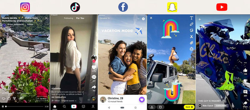
UI/UX of social networking services are quite similar.
The example above demonstrates the near identical UI found among several common social networking apps. This could be the result of the pursuit of usability or perhaps the pursuit of a universal UI that is common to all apps.
The process of prioritizing content presentation, user testing, growth hacking, etc. naturally leads to a similar user experience.
In any case, the service becomes all the more intuitive from the user’s perspective.
Users prefer a similar UI experience
It makes sense that many of the apps out there offer a similar user experience. It’s much more gratifying for the user.
Many users bounce back and forth between multiple apps every day, which can become exhausting.
Users have little motivation to learn a different interface again and again each time they download a new app.
This means that services that offer new value while following the existing UI and UX trends will naturally be easier to use.
Think about it – how many users would appreciate a “unique” UI on an e-commerce site that does not display a shopping cart icon in the upper right corner?
The human brain is not happy with services that deviate from the standard of UI design. Predictability is key.
Snapchat once tried to release an unconventional design by mixing up functions and changing navigation patterns.
The result was a near 73% drop in positive user sentiment and a significant drop in both the app’s user base and the stock price.
As you can see, innovative design is risky. Even if it’s similar to other apps, a consistent design is less likely to upset or confuse users.
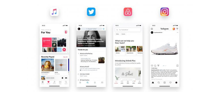
Many apps use common UI elements – Complexion Reduction: A New Trend In Mobile Design
Twitter dares not enforce its intellectual property rights
Twitter was the first to design a UX (Pull to Refresh) that reloads content when you pull down on the screen with your finger, which is now quite common among other apps.
This UX has been “imitated” by Instagram, Gmail, Facebook, etc., and has become so common and intuitive that users will try it without even thinking about it.
The original feature was developed for the now-defunct Twitter app, Tweetie, and Twitter Inc. owns this patent.
Even if other apps stole it, however, they would not enforce their rights.
There are two reasons for this.
First, there is no benefit in Twitter preventing other apps from adopting it.
More importantly, the more common its UX becomes, the more users will find Twitter easy to use.
Therefore, Twitter’s UX design policy is that it is OK to have the feature imitated by other apps or services.
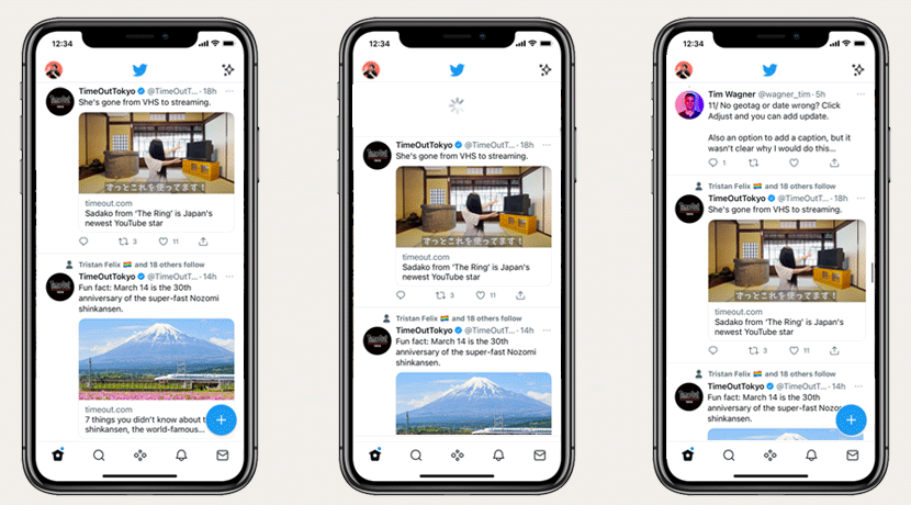
Twitter was the first to adopt Pull to Refresh
iOS and Android are growing while imitating each other
The most common similar UI/UX is probably that of the smartphone.
When Google announced Android soon after the original iPhone in 2007, many people thought it was simply a clone of the iPhone.
But in fact, with each subsequent update, they have “inspired” each other’s UI design and UX, leading each to improve their own precision.
For example, many of the features first implemented in iOS14 (released in 2020), such as widgets that allow users to display in-app content on their home screens, have already been implemented in Android.
Specifically, iOS14 included the Picture-in-picture feature for the first time in iOS history, but that was a copy of an Android 8 feature released in 2017.
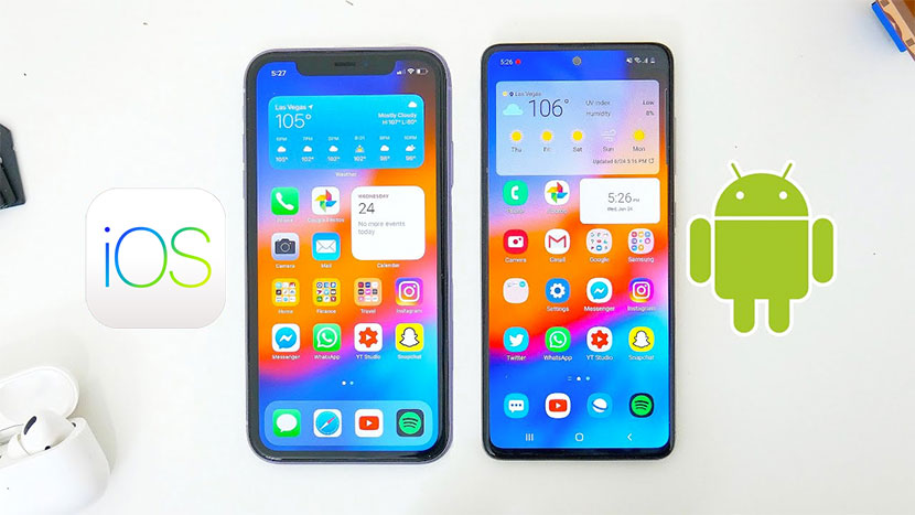
iOS and Android in friendly competition while inspiring each other
As is shown in the image above, many features seen in iOS were often originally implemented in Android.
However, Apple differentiates itself through interoperation with other devices, a more sophisticated UX, and immense brand power.
Perhaps, at least in smartphone OSs, the trend of piracy and upgrading seems to be a friendly competition.
From the user’s point of view, this is a much appreciated state of affairs.
Why you shouldn’t design from scratch
Let me be clear – when it comes to the realm of UI and UX, you should not force yourself to design from scratch.
First, if you provide users with a usage experience that has never been seen before, they will have to learn how to use it, which will naturally make it harder to use.
The average user wants apps, products, websites, etc., to have the same operating experience as what they are already used to.
The theory is that users have the same expectations for products that are similar to products they are already familiar with (this is known as Jacob’s Law).
This applies to everyday life as well. For example, have you ever stayed in a hotel and had trouble using the shower?
Many of us have accidentally started taking a cold shower because the faucet handle was designed sleekly and unconventionally, leading to confusion regarding how it actually worked.
Therefore, designing a “creative” UI that feeds the designer’s ego does not necessarily lead to benefit for the user.

A shower that is designed too stylishly and is difficult to use.
Users don’t want to put much effort into learning how to use a product. This is why Nielsen advocates “To follow platform conventions that users are familiar with.” (Ref)
All of the popular design patterns used throughout the world today were created by excellent designers over a long period of time, and it would be a shame not to use them.
Established patterns are the basis of a good user experience, and utilizing them is an essential part of the modern UX designer’s job.
If a solution to a problem already exists, then use it.
Users don’t care if it’s called plagiarism and stakeholders don’t care, either. But let’s not make a cheap and easy imitation, either, because it’s obvious and tacky to anyone who sees it.
Common Elements in UI
In today’s world, UI design, whether mobile or web, is almost never created completely from scratch.
In order to prioritize work efficiency and usability, it is almost always created by combining existing materials.
Unless a service is very unique, we can find no reason to design it completely from scratch.
In other words, designing a UI that does not exist anywhere else will often confuse users. This is like how the ingredients for mac & cheese are basically the same in every home.
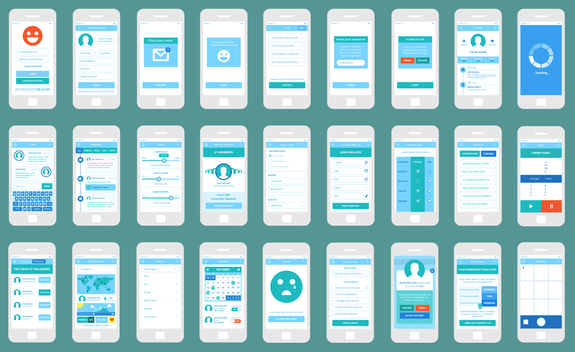
Many mobile UIs often leverage existing elements
Common UI Element Examples:
- Login button
- Hamburger menu
- Checkboxes
- Drop-downs
- Calendar
- Modal
- Breadcrumbs
- Slider
- Progress bar
- Search Icon & box
- Shopping cart icons
“How to imitate the right way”
If you want to take a good crack at UI and UX, we recommend that you imitate smartly.
To do this, you need to have a clear idea of who your users are and what their challenges may be.
Then, come up with a solution to solve that problem, and utilize whichever existing services and design elements that seem appropriate.
When you get to the final output stage, you can refer to as many well-designed services as possible and even trace them.
However, make sure that you put some originality into the look and feel of the design and, most importantly, the value offered by your service.
It’s a good idea to first sketch and annotate the UI and movement elements of an existing app on paper in order to achieve this.
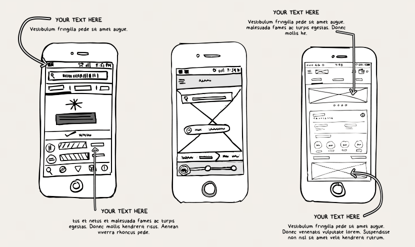
For UI tracing, I recommend sketching on paper
Then, research and merge elements from multiple apps, and then attempt to create a unique color scheme and atmosphere.
The image should be about 90% existing elements and 10% original elements. Your service will be easy to use but also have a sense of originality at the same time.
UX design does not have to be completely original
UX designers can sometimes get too caught up in doing things the “right” way.
In some cases, designers are too particular and overly prioritize being creative rather than focusing on user benefit.
If you have the time to create an original UI, you could probably create a better product by using an existing design system and devoting the same amount of time to understanding the user.
As you can see from the UX Pyramid, the basic principle of user experience is “FUNCTIONAL (USEFUL)“. This is overlaid with “RELIABLE” and “USABLE”.
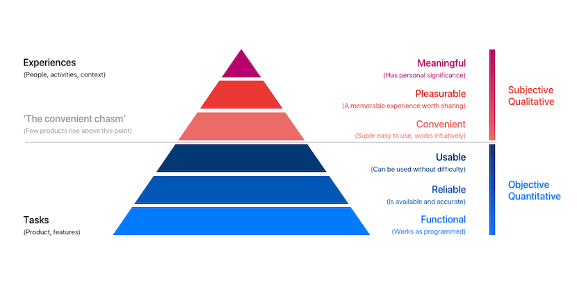
The UX pyramid – How To Get To The Top Of The UX Pyramid
To meet these requirements, the UX should not be too original.
If you want your product to be unique, you should do it through micro-interactions, copywriting, content, and branding.
*This article was created based on this Japanese article.
Written by: Brandon K. Hill / CEO, btrax, Inc.


