
Btrax Design Company > Freshtrax > Condering Cultu...
Considering Culture is Designing for Inclusivity
As things are going digital nowadays, designers’ roles are changing as well. When it comes to the services on the internet, as our previous freshtrax article explained, designers now need to think about numerous users around the world.
Specifically, it is necessary for designers to fully understand the users’ preferences and values when thinking about products and messaging. Simple translation is not enough when it comes to design communication.
Japanese express feelings with eyes, Americans use their mouth
There is a huge difference between Japanese emojis and American ones. Did you ever notice? Particularly in Japan, people use eyes to express their feelings, on the other hand, Americans use the mouth and its shape to show how they feel.
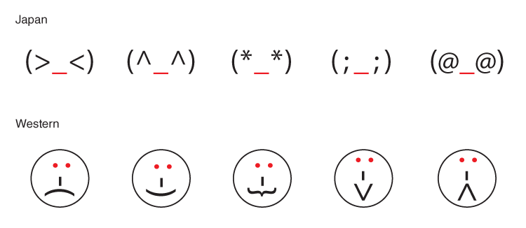
One of the causes for this is the difference of lifestyles. In Japan, especially during allergy season in spring, a lot of people wear masks. On the other hand, Americans tend to wear sunglasses to avoid direct sunlight.
In this, Japanese people may think people wearing sunglasses are scary the way Americans may think people wearing masks are scary.
As the Japanese saying goes, “The eyes say more than the mouth.” This might be the reason that Japanese anime characters have bigger eyes and American cartoon characters have bigger mouths.

The different understanding of colors
The way people imagine colors differs from countries and areas. In Japan we often see magazines and signboards using multiple colors. However, in the U.S., we see advertisements using only similar colors. These color characteristics reflect social backgrounds often found in childhood media.
The graph below shows what each color (blue, green, red, yellow) signifies in Japan, the U.S., France, and Egypt.
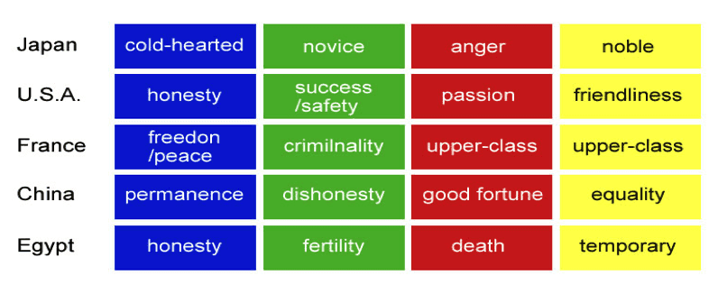
Basic Color Theory of different cultures by Lee Parks
Values differ from the social backgrounds
From the start, social backgrounds and standards in life differ greatly in different areas, so it is obvious that users’ values are diverse. For reference here, I would like to explain the values which we can see in Japan, China, and the United States to the following six value standards advocated by Professor Geert Hofstede.
Power distance index
This refers to the inequality which exists and is accepted between people. It is not just about a formal class system, but a concept of so-called “winners” and “losers,” as well as the degree of inequality in a company or at home.
Individualism vs. Collectivism
Whether there is respect for individual differences, Individualism can also be defined as a preference for individual work at a company or school. Its opposite is to prefer working in a group.
Masculinity
Better put as the concept of the competitiveness between individuals and companies in society. Not a “competitive society” but a concept that affects whether individual achievement is accepted and taught or uniform standards are taught
Uncertainty avoidance
It shows how one feels about uncertainty. Whether you feel uncomfortable with it or you eager to take the chance and step into the unknown.
Long-term orientation
Hofstede notes: “Long-term Orientation stands for the fostering of virtues oriented towards future rewards.” The opposite can be the YOLO ”You Only Live Once” spirit; the preference for temporary joy.
Indulgence
Indulgence is to allow children to have something enjoyable which may not always be good. Here’s a question: Do parents tolerate their kids’ different ways of thinking and their demands, or do they teach them to strictly follow their rules?
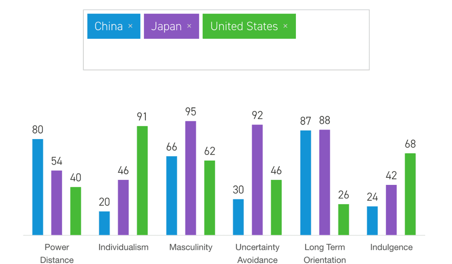
出典: Hofstede Insights
Different psychological attribute by cultures
How people feel physically and how they react to certain things also differs from country to country. The graph below shows the level of confrontation and expressing their emotions.
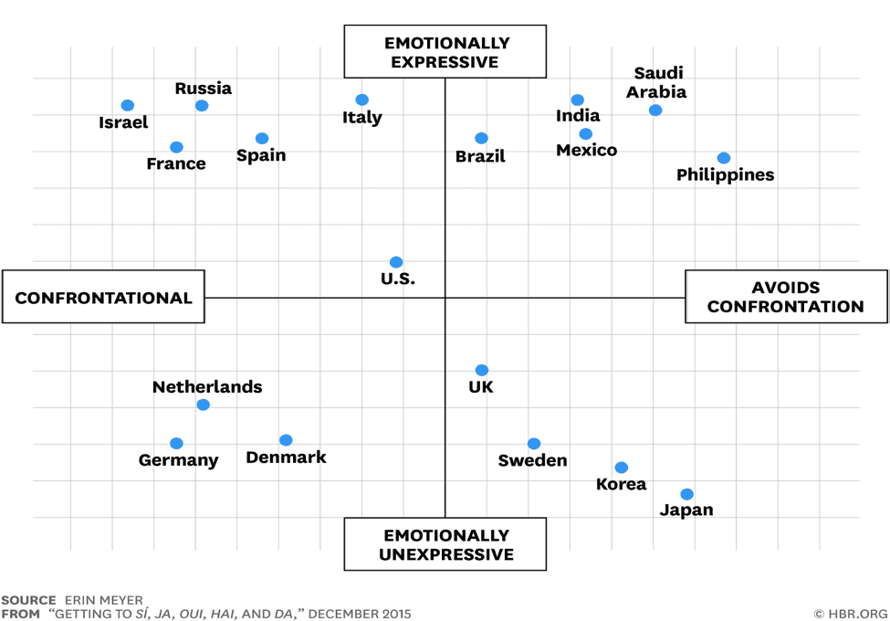
Getting to Si, Ja, Oui, Hai, and Da by Erin Meyyer on HBR.org
Yelp vs. Tabelog
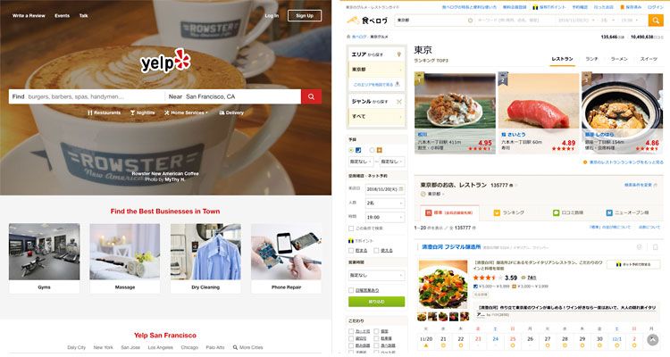
One of the best examples which illustrates how these psychological attributes differ between countries can be found on food-search services in Japan and the US. Especially in its composition and contents.
In Japan, Tabelog (食べログ) is the most popular food-search app. It can be said that it is the Japanese version of Yelp. Both provide almost the same services, whereas the UI they provide is completely different. Yelp prioritizes search effectiveness for individual preferences or wants. But on the other hand, Tabelog prioritizes operability or the function of recommendations.
Mercari’s “Hyper localization”
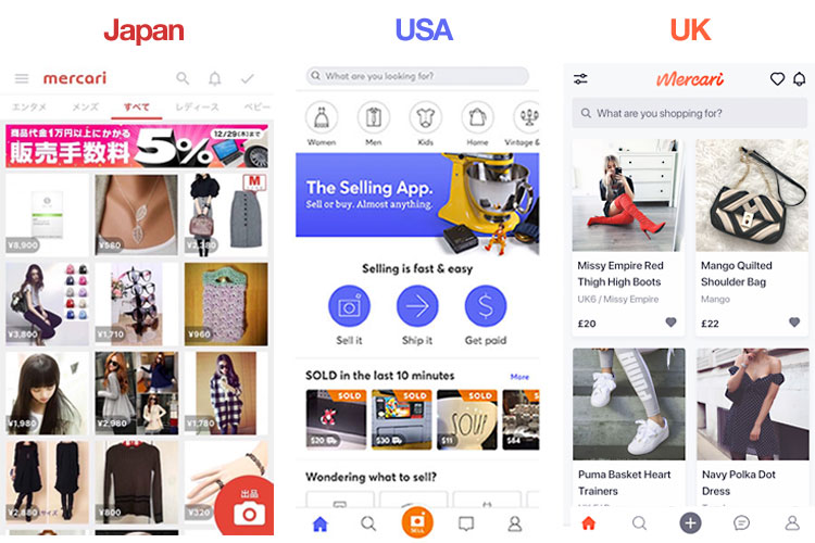
Mercari, a Japanese unicorn company which provides a “community-powered” shopping service, changes its logo for each country that offers its services which is quite considerable overall.

Moreover, they localize not only logos but the UI of the app and how they display their contents and its function.
The company states that they adopt the concept of “hyper localization.” Since values based on users’ daily lives are very important factors, especially in services like Mercari where digital and analog fuse together, they apply different branding, app services, and messaging to each country for Japan, the United States, the UK.
This is an interesting case because digital online services such as Google and Facebook provide almost the same services in every country, but Mercari doesn’t.
Design for different cultures
So, what kind of points do you need to consider in order to design appropriately for users with different cultural backgrounds? Here are some points to keep in mind.
1. Design is all about the communication with users
One of the most important processes in design, at all times, is to never neglect in communicating with users. It’s not too much to say that the users know the answer, not designers. Especially when the designers have different cultural backgrounds as users, they need to share information, conduct user interviews and focus group interviews, and do ethnographic research in order to truly understand their users.
2. It’s localization, not translation.
Even though it is the same language, there are words which have different meanings in American, British and Australian English. For example, “chips” refers to snacks represented by potato chips in the United States, whereas “chips” refers to french fries in the UK. The same thing is also called “frisket” in Australia.
3. Search effectiveness vs browsing
As stated above, Japanese users tend to prefer to be “guided” while in the U.S. users prefer to “search” by themselves. This recognition can lead to a better UX for people with different needs.
4. Understanding for the usage environment
Globally, smartphones are the main devices most of us use. However, the usage percentage differs from region to region. You can use the internet almost anywhere in developed countries and we take it for granted. But, there are regions where the internet connection is not good enough and the speed is still slow. We have to be aware of other usage environments which are not always the same as ours.
5. Don’t rely too much on colors
This is a fairly special situation in Japan, but UI which relies on ‘color’ is quite dangerous. As I mentioned above, there are the different significations upon each color by regions. And also we need to think about how it is seen by someone who’s color-blind. These recognitions can make the difference between the UI of Rakuten market and Amazon.
Inclusive design is the future
Designers’ works will become more and more globalized in the near future. Along with that, understanding what kind of values the users in different regions possess is important. A design method which considers diversity will be required. This is a common concept known as “inclusive design,” which designs for people who have many different values and backgrounds.
We btrax offer UX design, service design, and branding services based on the true understanding of the values the target customers have. If you are interested in global expansion, please contact us. Enjoyed this article? Sign up for our newsletter! We look forward to hearing from you.


