Btrax Design Company > Freshtrax > UX/UI degn of f...
UX/UI design of financial services in Japan and the United States
The other day I was watching a Japanese TV program in which celebrities were challenged to purchase items using self-checkout machines at convenience stores.
The challenge was to purchase a specific product using PayPay within a certain time frame.
I was a little surprised to see some of the celebrities, mainly those of a slightly older generation, failing in the challenge.
However, my grandmother, who was watching with me, commented that she didn’t know how to use it either.
In the San Francisco Bay Area, where I currently live, the introduction of self-checkout machines, as well as payment-related digitization, has been progressing and from what I’ve noticed many elderly people aren’t confused by these types of technologies.
I get the impression that many of them know how to use electronic wallets on their smartphones.
Therefore, I thought that this difference might be a problem on the design side, which will be explored in this article.
Differences in Payment Methods between Japan and the U.S.
The Bay Area is going cashless. When I went shopping at Trader Joe’s supermarket the other day, no one paid with cash, but instead used credit cards or electronic wallets.
In Japan, on the other hand, is basically still a cash-based society.
The last time I was back in Japan, I often paid in cash at restaurants and for groceries. I think there are two main reasons for this:
- Trust in cash
- Cost of introducing cashless payments.
Regarding the first point, I think people feel more secure actually handing over or receiving money with their own hands.
While the younger generation is ready for the digitalization of payments, it seems that there is still a mindset issue in shifting from cash-based to cashless among the older generation.
Regarding the second point, the cost of introducing cashless payments holds businesses back from moving forward.
There is of course a cost to implementing software and it may be challenging to promote cashless payments with limited financial support or incentive.
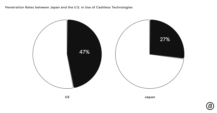
Here is a comparison of cashless payment penetration rates in Japan and the U.S.
As can be seen from the graph, there is a 20% difference in penetration rates between Japan and the U.S. in the use of cashless payment technologies.
However, due in part to the influence of COVID-19, the shift to cashless transactions in both countries has been heavily promoted compared to a few years ago.
One of the issues with this shift to cashless transactions is how to reach the elderly, who may not be very familiar with digital technologies.
I believe that improving the UI/UX of cashless services, in general, will become important to ensure that the elderly are not left behind.
Bank transfer process in Japan and the U.S.
When transferring money to an account in Japan, the process is a manual one that requires you to go to a physical location, whether it’s an ATM or a bank, and bring the money with you.
There are no checks and digital transfers are not common.
Mobile banking, which allows users to easily transfer funds through an app, has had a significant impact on mobile banking usage in Japan and the United States.
In fact, data shows that the mobile banking penetration rate in Japan is 20% (source), compared to 90% in the US (source).
How to increase mobile banking penetration?
Given the Japanese people’s trust in cash, resistance to mobile banking may be hard to overcome.
In fact, I believe that if users prefer analog money management, such as transferring money by hand, because user satisfaction is the first priority, there is no need to force them to change.
However, if you still want to promote the digitalization of financial matters, one way is to improve the UI of mobile banking applications.
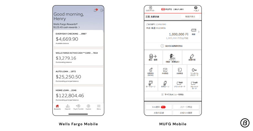
Let’s compare the home screens of apps released by Bank of Mitsubishi UFJ and U.S. bank Wells Fargo.

The Bank of Mitsubishi UFJ app lists 11 functions from the home screen.
In contrast, Wells Fargo’s main features are balance and account information, and to access other features, you need to go to the menu page in the tab bar at the bottom.
While Mitsubishi UFJ’s UI design is more convenient with its one-tap access to various functions, the digitally challenged, including the elderly, may find this plethora of information rather confusing.
Wells Fargo’s app gives the impression of “simplicity” because there is no congestion when the app is opened, although there is a need to tap one extra time to use other functions.
The advantage of cramming many functions into one app is that users will not have to install several apps, but the disadvantage is that some people will not be able to use the app.
In order to make it easier for the elderly to use, it may be necessary to simplify the task by focusing on a small number of tasks.
Self-checkout in Japan and the U.S.
Next, let us look at self-checkout in Japan and the U.S., specifically the information architecture of self-checkout.
Both countries have been aggressively introducing self-checkout systems recently, partly due to COVID-19.
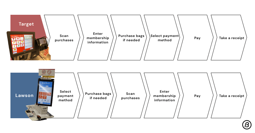
Here we compare the self-checkout systems of Lawson, a Japanese convenience store, and Target.

Comparison of the self-checkout systems of Lawson, a Japanese convenience store, and Target.
One of the major differences that can be seen here is the order of actions taken by the user.
In Lawson’s self-checkout system, the user selects the payment method first, while in Target’s self-checkout system, the user scans the items first and selects the payment method just before paying.
The key to UX is how “intuitive” the design is. For example, when you are shopping online, you can select:
- Add items to the shopping cart
- Enter your address
- Select payment method
- Make payment
- Receipt
This is the order in which you shop. And not only online, but also during in-person checkout.
- Give the items to the clerk
- The clerk tells you the total amount
- Pay the amount
- Receipt
This is the order in which the checkout process takes place.
Most people are accustomed to this order, and I believe that information design should be applied to self-checkout systems to achieve a similar UX.
The intuitive and familiar design will contribute to increasing the usage rate, including among the elderly.
Conclusion
In this report, I compared the UX/UI design of financial services in Japan and the United States.
Now that both digitalization and aging are progressing, it will be important for designers to find ways to design services and products for the elderly.
The “simplicity” and “intuitiveness” that characterize U.S. design may provide hints for elderly-friendly design in Japan.
Written by Suzy Ito


