Btrax Design Company > Freshtrax > 6 Best Practice...
6 Best Practices for Creating Landing Pages
A landing page is any page on a website where traffic is sent specifically to prompt a certain action. That can be anything from signing up for a service to downloading a document. Creating landing pages tailored to different promotions is important because visitors click on your links with varied goals and expectations in mind. Companies and brands need to be able to customize this experience for visitors.
So what makes a great landing page and how do you use them to increase your conversion rates? This article summarizes some of the key design elements you need to be aware of when creating landing pages.
1) Keep the page simple and uncluttered
A landing page needs to get to the point, so leave out all the unnecessary information and keep it simple. The visitor should be able to skim your page and find what they’re looking at a glance. Provide all the essential information that your audience needs and nothing more at first glance.
 Photo by: Prezi
Prezi gives the visitor just enough for them to get a gist of what Prezi is about at first glance. After that, the visitor has the option to learn more if they scroll down.
2) Guide visitors through the desired path
Be aware of all the paths entering and leaving the landing page. You want to minimize the number of exit points (e.g. links away from your page) and funnel your visitors down the desired path. Make sure all the paths lead straight to fulfilling your goal.
For example, if your goal is to get people to submit their email and download your white paper, then make sure that this is the highlighted action on the page and there are none or few other paths the visitor can take.
3) Ask for as little information as possible
The more information you ask for, the lower your conversion rate. Drop off rate increases exponentially (to more than 50 percent) if you ask for information beyond name and email.
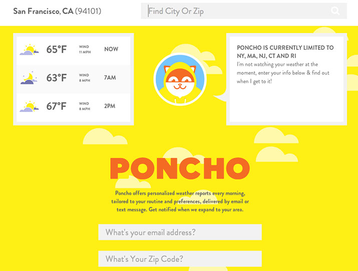
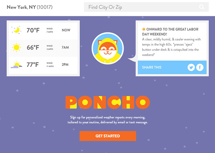
Poncho provides a great example of a good landing page. Poncho offers personalized weather reports every morning, tailored to the user’s routine and preferences and delivered by email or text message.
Since Poncho’s customized weather service is only available in certain states, it shows the visitor two different landing pages depending on service availability. Both pages are simple and make signing up seem very easy.

Above is a screenshot of the landing page for visitors who aren’t in Poncho’s area of service. For those visitors, Poncho will ask for their email address and zip code so they can notify them when the service becomes available.
As you can see, they are only asking for the necessary information in order to deliver what they promise. They’re not even asking for the visitor’s name because they don’t need it yet.

Separately, here is a screenshot of the landing page for visitors who are in an area where the service is available. Poncho changes its call to action from “Get notified” to “Sign up” and proceeds to survey the user one question at a time to get them the personalized service they want.
The surveying process is interactive and simple, and doesn’t feel like you are filling in a form. This makes collecting information and signing up very easy for new users.
Photos by: Poncho
4) Have a clear call to action
The main point of conversion on your landing page needs to stand out and be clear, not vague. Make sure your headlines and text are bold so your visitors know exactly what you want them to do!
For example, if you’re trying to get people to submit their emails to download a beginner’s guide to UX design, then your call to action button should say “Download your free guide to UX design” as opposed to “Submit.” That way, the visitor will know exactly what they’re doing when they click the button.

Photo by: CIO White Papers
5) Communicate a value to the visitor (as opposed to yourself!)
People care about the value you provide for them, not the other way round. So make sure your messaging communicates that.
For example, your subheading might be: “Learn how to optimize your website’s UX to maximize conversion rates.” Here, the value provided to the customer is communicated through the words “learn” and “your.”

Photo by: LinkedIn Pulse
6) Look great–all the time
Your landing page should be comfortable to look at and not turn people away. On top of that, it should look good on any screen size as well to avoid losing potential conversions when visitors use different devices to access your page.
Having a landing page that looks great on any device can increase your conversion rate and revenue by over 50 percent. Decide on whether you should have a separate mobile site or a responsive website depending on the kind of traffic you receive and the structure of your website.
Consider who who you’re talking to and why
Before you design your landing page, don’t forget to consider who your audience is and what your goals are. This will help you focus your design to include only the relevant elements and leave out what’s unnecessary.
Also, be mindful of who your competitors are and what they are doing. If they are succeeding, you should pay attention to what’s working for them and make sure your strategy is on par if not better.
Featured photo by: Eran Sandler


