Btrax Design Company > Freshtrax > 7 Elements of a...
7 Elements of a Japanese e-Commerce Web Page – The Japanese Information Dashboard
Some people view Japanese web pages with curiosity and puzzlement with its busyness. We will try to relieve the mysticism and frustration by pointing out certain elements in an example Japanese web page and why it works for the Japanese.
As a general guide, Japanese web pages act as a one-stop trip for most Japanese-a sea of information that just tantalizes our brains but comforts the inhabitants from the land of the rising sun. It is quite organized as the each section or module has meaning. Pastel colors and flash is a given for these pages.
In a previous blog on Japanese landing pages, we discussed how ‘kanji’ characters add another level of busyness for the our eyes with its 23 strokes versus the more simple 4 stroke roman alphabet.
The sea of information creates the aura of an information dashboard for the Japanese. It gives the Japanese customer the feeling that the company has a lot to offer. The marketing approach is to put a lot of products with reasonable prices in front of the customer so that they may walk away with more than what they were looking for – a kind of Costco-here it is/buy me- approach.
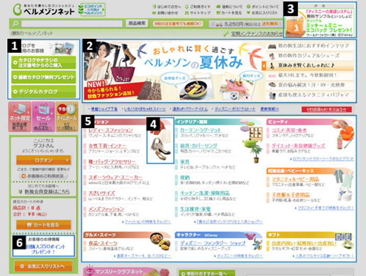
We will review 7 elements from a Japanese web page to discuss its nature from a well known women’s catalog B2C company.

#1 Catalog Subscribers Get Preference
Print is not dead in Japan but lives in a very common co-existence with its digital sibling. E-commerce is big estimated to hit $49.8 billion in 2010. Ease of catalog purchases by allowing web entry of catalog numbers enables e-commerce.
#2 Flash Advertising Campaign Area
Adobe Flash elements are very common in Japanese websites. Sales promotions or campaigns are centralized in one small area near the top. Many promotions run in parallel especially in large e-commerce sites.
#3 PR Banner IDs Site’s Partners
Notice the PR on top of the module. This is the designation in Japan for 3rd party partners or advertisers and tells the consumer that this is not a direct affiliation with the company’s website. Like other sites, the elements of the module change every time you enter the web page.
#4 Icons Provide Visual Identification
Japanese sites give the viewer some visual icons to identify the module’s contents. It reinforces the type of goods in that are on sale in the product category.
#5 Colorful Product Area
Use of pastel colors and variation of colors is very common to Japanese web pages. Since this site is positioned for a female audience, pink is used for female items.
#6 Customer Satisfaction Area
Entices people with points total and shows ways people can earn more points. Earning points during different campaigns provide more customer engagement and some extra web page clicks.
#7 ‘keitai’ or Mobile Phone Friendly
The ‘keitai’ or mobile phone is king here. Having the ability to view the websites on your long commute home is important. The QR code helps the Japanese consumer with access to the mobile compatible site. The QR code is scanned by the user and allows access to the mobile friendly site for the mobile hunter.
Understanding the essence of the Japanese web site is important to understanding how to localize a site for the Japanese market. Translating the web information is sometimes not enough in localizing the Japanese information dashboard.
photo by Trey Ratcliff


