Btrax Design Company > Freshtrax > What viting Jap...
What visiting Japan taught me about quality user experiences
This past June, I had the chance to work in Tokyo on a project. Not knowing Japanese meant every exchange in this foreign city stood out, from loading my subway card to ordering lunch bentos at the local food truck.
I saw how interactions in San Francisco feel natural and invisible, but are guided by mental models of how I expect the world to work.
The locals in Tokyo clearly had their own mental models. While there were some awkward moments, I found experiences like riding the subway and eating at restaurants surprisingly smoother and even more pleasant than their SF equivalents.
This emotional response is one of “deep pleasure,” a term coined by Aarron Walter in his book, Designing for Emotion. Deep pleasure occurs when an experience moves all the way up a hierarchy of functionality, reliability, and usability.
Walter’s theory is often used to argue for form over function. In this article, I use Walter’s theory simply as a framework to explore how Japanese transportation and restaurants climb up the hierarchy to create deeply pleasurable experiences.
What Makes a Great User Experience?
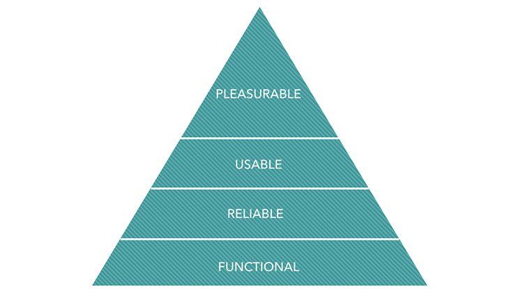
Aarron Walter’s hierarchy of user needs
According to Walter, there are two types of pleasure: surface pleasure and deep pleasure. Surface pleasure around a product is like dessert; it works best after a satisfying meal. We often see surface pleasure in the form of witty microcopy and charming animations in digital products.
Without the foundation of more basic user needs, products that only provide these elements risk being forgotten once users find a more enriching experience.
Deep pleasure is a more fulfilling and rewarding experience. To achieve it, products must first offer a functional purpose, perform reliably, and operate intuitively. Products that meet these tiers of user needs can put users in a state of flow, or total immersion in their task.
User-friendly Transportation
In San Francisco, public transportation is the last thing you’d expect to give you deep pleasure. On the San Francisco Bay Area’s transit system, BART, rides feel like one tense, bated breath in the face of constant delays, confusing signs, and filthy cars.
I took this anxiety with me to Tokyo. To my surprise, I enjoyed getting around, with the exception of a few sprawling stations (Shinjuku, I’m looking at you). The well-mapped, punctual, and spotless transportation systems felt like a huge sigh of relief.
From Functionality to Usability
Walter’s theory shows why the two countries’ systems feel so different. Both systems function to get you from one place to the next. BART remains stuck in the functional tier however, unable to rise to the level of ‘reliable’ with its frequent delays.
Punctual to a T, the reliability of Tokyo transit provided the peace-of-mind I needed to brave rush hour crowds. I would trust the Tokyo subway to get me to the ER if I were in labor.
Building this type of trust is crucial to making people want to come back to your product.
Tokyo subways meet the next level of usability needs with their strong information architecture. Bilingual signs seemed to anticipate my needs at crucial moments. When rushing blindly towards the sound of an approaching train, I would look up to see signs like this appear like magic.
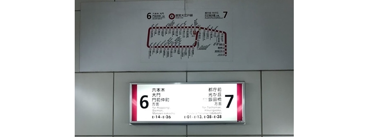
The list of stations on either side of the sign shows which direction each side of the platform takes you. I would immediately know whether to slow down or try to catch that oncoming train.
This is called progressive disclosure, where products share the optimal amount of information a user needs to make a decision at the right time. As a user, I appreciated the nudges but didn’t feel overwhelmed by choices.
Another example of thoughtful usability happened when I was traveling to Haneda Airport. Markers on the platform matched up with the car doors of different lines, telling me where to stand to get on the right car. The extra guidance reinforced my sense of confidence when heading to catch a time-sensitive flight.
Deep Pleasure Experiences
Moments of delight then elevated my Japanese transportation experience to one of deep pleasure. When exploring Kamakura, I found myself stressing about which shrines to visit on limited time.
As if on cue, I noticed an interactive touch screen map near the subway exit. The map showed defining features of each shrine and where they were located. The unexpected use of modern technology to celebrate history left a lasting impression on me.
To top it off, Japanese summers are humid, sticky affairs. Grabbing a refreshing drink from touch screen vending machines like these made waiting for trains feel whimsical.
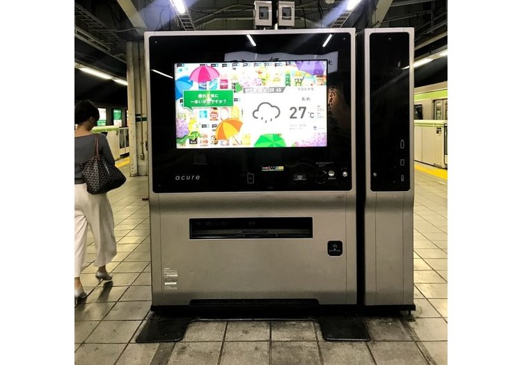
Japan’s Standout Service
In San Francisco, restaurant service is a mixed bag. People tend to expect deeply pleasurable experiences at more upscale restaurants. Most self-service restaurants remain stuck in the functional, reliable, and usable tiers.
It’s hard to have a bad restaurant experience in Tokyo. Small shops run like well-oiled machines. Coming from a culture where you tip for service, I was surprised at the quality of service at even the most casual restaurants.
Foundations as Service
A number of factors keep restaurant service speedy and attentive. Many of the more casual shops have a self-service vending machine outside, where diners can pre-order their meal while waiting for a table.
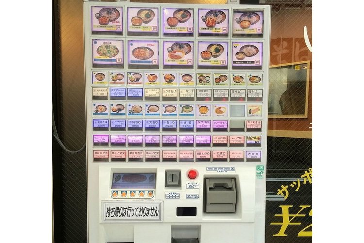
Knowing no Japanese made it hard for me to use the machine the first time. The sheer number of buttons and Japanese characters felt overwhelming. Even so, it gave me confidence that I would get my order more quickly while waiting outside the shop. This feeling satisfied my need for reliability.
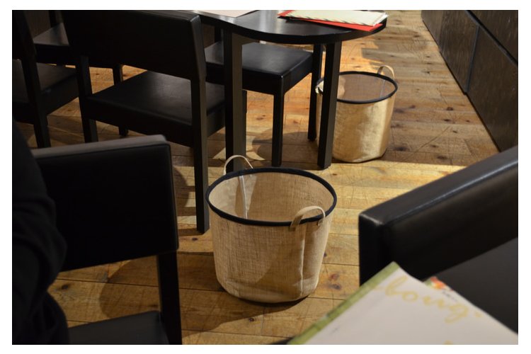
Restaurants moved up to the usability level with their thoughtful learnability and clear organization. Most restaurants contained baskets where you could store your belongings.
Sometimes, using these felt obligatory. When seeing my bulky camera bag next to me, waiters would politely urge me to put my bag in the bin. I saw that organizing personal belongings helps diners focus on the food in these tight, busy spaces.
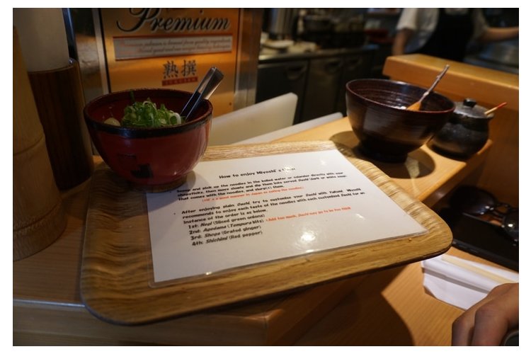
Some restaurants used progressive disclosure to make the dining experience feel smooth. After ordering from this restaurant in Kyoto, I received this set of instructions with my udon. The perfect timing made the instructions feel friendly and informative rather than restricting. I still felt in control of my meal – assisted, not directed.
Beyond Usability
The orderliness of these spaces became a visceral experience where surprise and the foreign brought deep pleasure to each meal.
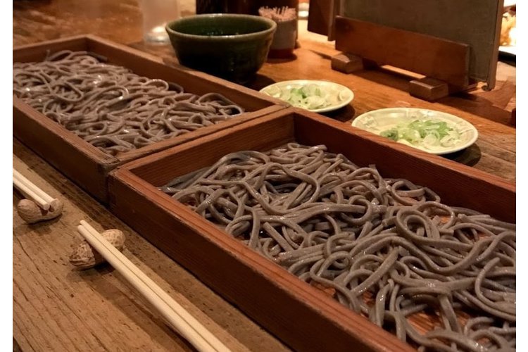
When eating at a soba restaurant by my hotel, the creative use of peanuts for chopstick holders set the tone for a unique meal.
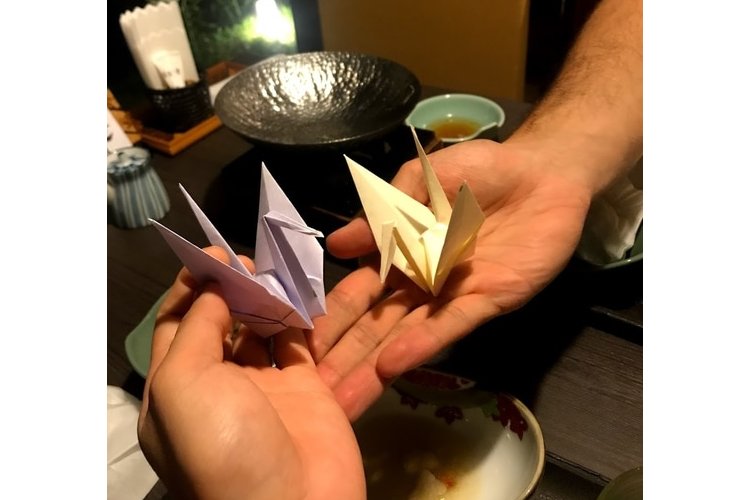
At the end of a traditional meal, the server surprised me with these origami cranes. This thoughtful touch stayed with me as a lasting memory of my experience.
Usability Gone Wrong
Not all experiences went so smoothly. Some environments bombarded my senses with information overload.
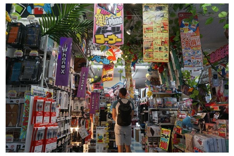
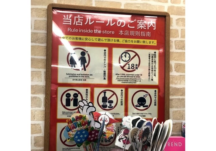
Some attempts at progressive disclosure also felt abrasive to my western mental map. For example, this store, while filled with functional signs and items, was too much to the point I found it nearly impossible to navigate. Even maps inside and out of train stations were packed with information hard to use. Rules about proper behavior and etiquette are placed everywhere, and this felt controlling at times.
UX Takeaways
Walking through Tokyo gave me a fresh perspective on what makes a memorable user experience. While examples of bad usability litter the world around us, quality experiences feel tougher to define as they offer less friction.
In particular, Japanese transportation and restaurants offered top-notch learnability with their well-mapped information architecture and use of progressive disclosure. Laying this groundwork made me comfortable enough to appreciate and remember moments of surface pleasure.
User needs build on each other to prepare the user for moments of delight. Too often, we look to cut and paste parts of designs we love, hoping it’ll work the same magic for our own products. While it is important to imitate success, we should think of solutions holistically and make sure they provide the necessary ingredients for pleasure.

