Btrax Design Company > Freshtrax > Is “Simpl...
Is “Simple” Really Your Design’s Best Solution?
How many times have you heard it in a design meeting? “Let’s keep it simple.” “Can we simplify this?” “It needs to be simpler.”
In the world of design, “simple” has become the go-to buzzword—the safe choice that nobody questions. When building mood boards or listing design keywords, “simple” almost always makes the cut. It’s the fallback suggestion in client meetings and the knee-jerk feedback during design reviews.
But here’s the million-dollar question: What exactly do we mean by “simple”?
Is it about stripping away elements? Reorganizing information? Minimizing decoration? The word has become so overused that it’s lost its precision.
Here’s the truth: simplicity isn’t a one-size-fits-all solution—it’s an approach that changes based on context and purpose. And sometimes, “simple” is actually the wrong answer.
Breaking Down “Simple”: It’s More Complex Than You Think
When we talk about simplicity in design, we’re actually referring to several distinct concepts:
- Essential Simplicity: Ruthlessly curating information and eliminating everything that doesn’t serve the core purpose. It’s about what you leave out.
- Functional Simplicity: Creating clarity through structure and organization—even when dealing with complex information. It’s about how you arrange what stays in.
- Visual Simplicity: Crafting a clean aesthetic with minimal decoration. It’s about what meets the eye.
These approaches couldn’t be more different in practice. Consider these examples:
MUJI’s packaging embodies “essential simplicity”—including only what’s absolutely necessary to convey the product’s identity. Nothing more.
Amazon’s interface, despite being information-dense, achieves “functional simplicity” through thoughtful organization that guides users naturally through the experience.
Apple’s products represent “visual simplicity” while maintaining sophisticated functionality—proving that minimalism doesn’t mean compromising capability.
All three brands can claim “simplicity” as a core value, yet each interprets it in fundamentally different ways.

Left:MUJI’s package design
Right:Amazon Japan’s UI design
“Simple” Isn’t Culturally Universal
While we’ve been unpacking what “simple” means in design, it’s also worth noting that the idea of simplicity itself isn’t culturally neutral.
In Japan, minimalist design is often rooted in philosophies like “Zen,” “Wabi-sabi” (imperfection and impermanence), and “Ma” (the space between things). These values lean toward softness, asymmetry, and a kind of quiet intentionality. Think: neutral tones, organic textures, and design that breathes.
Meanwhile, minimalism in Western contexts has been greatly influenced by European design movements of the early 20th century. Modernism, the Bauhaus school, and De Stijl all contributed to a design approach that values functionality, clarity, and rationality. These principles traveled across borders through global exchange and now appear in everything from corporate branding to digital interfaces throughout North America and beyond.
Of course, not all design fits neatly into these categories. In our global design landscape, these influences constantly overlap and blend. As a design agency working across both Japanese and American contexts, we see these cultural exchanges happening every day.
Different cultures arrive at “simplicity” through different paths. And when working across cultural boundaries as we do, being sensitive to these nuances can make all the difference.
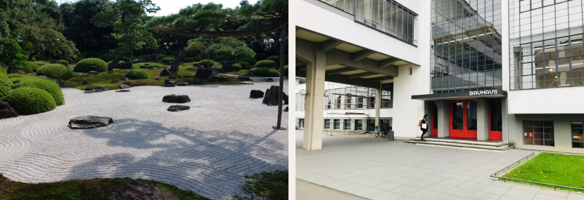
Left: Japanese- style garden design
Right:Western-style building design
A Language Lesson Worth Remembering
During my design studies in the U.S., a professor highlighted an important linguistic distinction:
- Simple: Clear, usable, efficient—a positive descriptor for well-executed designs
- Simplistic: Over-simplified to the point of losing essential meaning or function—a criticism
- Minimalistic: Deliberately reduced to its purest elements in pursuit of aesthetic beauty
When presenting design work in English, choosing the right term matters. “Simplistic” suggests you’ve cut corners or missed the point entirely. Reserve “simple” for designs that make complexity accessible, and “minimalistic” for those that elevate reduction to an art form.
The Real Purpose of Design
Let’s get back to fundamentals: design exists to solve problems effectively.
Sometimes, the best solution isn’t visually simple at all. Consider wayfinding signage in a major transportation hub. It needs to communicate multiple languages, various exits, connection information, and nearby amenities—all at once. If travelers can navigate confidently to their destination, that complex system is considered successful design, regardless of whether it looks “simple” on the surface.
The next time “make it simpler” emerges in a design conversation, pause and ask: What problem are we trying to solve? What does simplicity mean in this specific context? Is simplification actually moving us toward the optimal solution?
Great design isn’t simple or complex by default—it’s appropriate. And finding that sweet spot requires thinking beyond simplistic labels.
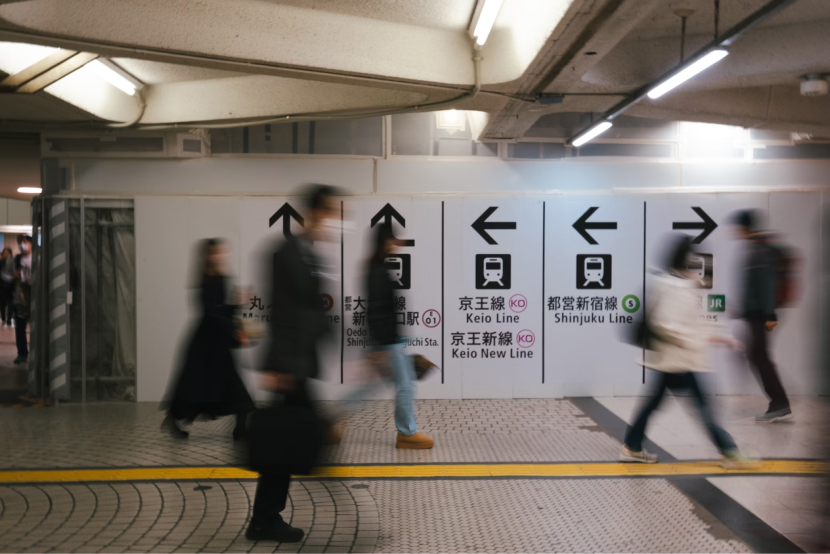
Simple and informative station signage
Struggling to balance simplicity with effectiveness in your design, especially when entering new markets? At btrax, we specialize in navigating the cultural nuances that shape successful design across Japanese and American contexts, ensuring your solutions are appropriate, not just simple. Contact us today to discover how thoughtful design can drive your business forward!
We provide Japan Market User Research Services
Gain real insights from Japanese users before entering the market. btrax bridges the gap between global companies and Japanese customers with culturally-aware user research and strategy.