Btrax Design Company > Freshtrax > Cultural Contra...
Cultural Contrasts between Japanese and US Landing Pages
When western people look at Japanese web pages, a lot of us are taken aback from the sheer amount of work on the page. Some have said the Japanese landing pages are puzzling, even crowded. It almost seems like the page jumps out at you.
We will take a look at the top three ranked google search engine results for the search term ‘plastic surgery’ in English and Japanese and then do some contrasts and comparisions between US and Japanese landing pages from a marketing, design and cultural context.
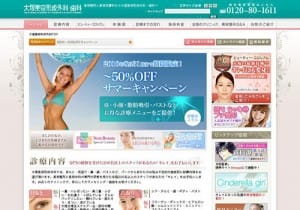
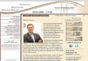
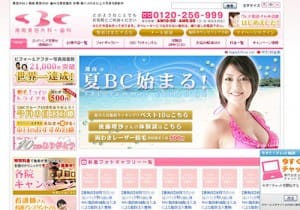
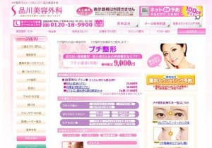
Top 3 US and Japanese Landing Pages for Plastic Surgery
| Landing Pages in US | Landing Pages in Japan |
 |
 |
 |
 |
 |
 |
US Landing Pages Disected
With some of the horror stories about failed medical procedures out there, the message is trust. In the US, trust needs to be earned by the consumer. If you look at the ‘plastic surgery’ landing pages, the persuasive elements answer the basic questions in the consumers mind -Why Dr XYZ?, Why should I go to this clinic? and How safe is the procedure?
As far as the design is concerned, we see simplicity and organization. Many experts promote simplicity – wide open design, common and conservative colors, no moving flash elements.
The pages are very professional, with the picture of a medical professional front and center on the page almost somewhat sterile. Social bookmarking is probably more common to keep bringing people back. The strategy is to drive people deep in the bowels of the web site so a site search engine is common.
These landing pages are for rich and famous to look young and pretty and the prices more than confirm that.
Japanese Landing Pages are “kawaii” or pretty
As with the US, most of the Japanese plastic surgery audience are women. In contrast to the US, the Japanese audience is targeted towards the average every day woman and affordable prices. The audience appeal is about how happy and beautiful you are going to be after the procedure is done. Many average-looking models are used to convey this message so that the consumer can identify with them.
Discounting campaigns are very common to motivate the Japanese consumer with tiered package deals and discount coupons.
The Japanese landing page design is quite bright and efficient. The use of pastel colors with every space of the page is common. Many moving flash elements are used and this is considered fun and happy for the Japanese consumer. The Japanese expect their websites to be interesting.
The Japanese header has more information because the Japanese are an information society. They want tons and tons of informantion in one place and with the Kanji you can do that. In a few kanji characters, you can convey a very complicated thought – no need for site search engines.
Speaking of Kanji, another thing that complicates the look of the Japanese landing page is the ‘kanji’ characters. Kanji characters can have up to 23 strokes as opposed to English characters which have at most 4 strokes. This also gives the appearance to the western eye of busyness.
Getting used to the landing page designs are a tough thing for companies moving from the US to Japan markets. Partnering with cross-cultural consultants can help guide you through the puzzling and the crowdedness of Japanese landing page marketing and design.
Thanks to btrax staff members, Reina and Tai on collaborating on the content on this article.
We provide Japan Market User Research Services
Gain real insights from Japanese users before entering the market. btrax bridges the gap between global companies and Japanese customers with culturally-aware user research and strategy.