
Btrax Design Company > Freshtrax > Things to Know ...
Things to Know Before Making an iPhone Website
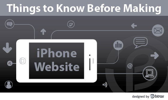
When iPhone and iPad closed out the year 2011 with 52% of mobile web market share, you know it’s time for your business to have a decent iOS website. This article tells you everything (well, almost) you need to know to start making a mobile web for the iPhone. We will follow up with another post targeting the iPad specifically.
Before rolling up your sleeves to get the design started, let’s go over some iPhone basics:
Scree Size v.s Resolution
Although the 3.5-inch screen size stays the same across all iPhone models, resolution on older iPhone models (original iPhone, iPhone 3G, iPhone 3GS) is 320×480 pixels, which is significantly lower than the 640×960 pixels “Retina Display” equipped on the iPhone 4&4S.
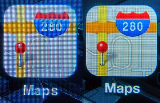
What does this have to do with designing an iPhone website?
Difference in resolution causes the density of pixels on iPhone 4&4S to be 4 times greater (326 DPI per inch) than that on older iPhone models, even though they share the same screen size. This means each site we must have 2 versions of images for original resolution and the retina resolution.
But don’t be frustrated because most of the time, all we need to change is just the image elements. For instance:
- For original iPhone models, same the image as something like “freshtrax.jpg”
- For iPhone 4&4S, the name would be “freshtrax@2x.jpg”
Layout
- Part 1– Normal size icon, and double size icon
<link rel=”apple-touch-icon” href=”/apple-touch-icon-iphone.png”/>
<link rel=”apple-touch-icon” size=”114×114″ href=”apple-touch-icon-iphone4.png”/>
- Part 2– Tell the iPhone 4Xbrowser to use 2X size image
<link rel=”stylesheet” media=”only screen and (-webkit-min-device-pixel-ratio: 2)” type=”text..”/ >
Stay tuned for the next post about making iPad specific websites.
We provide Japan Market User Research Services
Gain real insights from Japanese users before entering the market. btrax bridges the gap between global companies and Japanese customers with culturally-aware user research and strategy.