Btrax Design Company > Freshtrax > The Essence of ...
The Essence of Design: Its 4 Key Roles in Our Lives
“What is design?”
This is a never-ending question for designers and others alike.
Different people have different concepts of “design,” and this is often the cause of miscommunication and even minor disputes.
The roles of today’s “designers” are incredibly diverse, making it quite difficult to sum them up in just a few words.
As the scope of “design” continues to expand, the question, “What is design?” broadens. Generally speaking, it is similar to the question, “What is language?”
So, what is design anyways?
“What is design?”
In other words, “What is the role of design?”
As someone who has devoted my life to design, I’ll try to answer this question in my own way.
Broadly speaking, there are four roles of design.
The Roles of Design:
- Visualization
- Problem Solving
- Guidance
- Simplification
Role of Design 1: Visualization
Design is the visualization of thought.
– Saul Bass
This is probably the function of design that most people imagine when they hear the word “design.”
This encompasses the look, the colors, and other so-called “decorative” roles of design.
Although it may seen obvious, this is one of the most important definitions of design.
So, what exactly does design visualize?
Here are some examples.
What Design Visualizes – Information
What is likely the most familiar form that design takes in your daily life is the ways that design can visualize information.
The world is filled with a wide assortment of information, and one of the roles of design is to display this information in a way that is easy for people to understand and use in an intuitive manner.
For example, as shown in the image below, converting the table on the left into the graph on the right is enough to make it much easier to understand. This results in a more intuitive and understandable presentation of the information, which also leads to a reduction in the time needed to communicate said information.
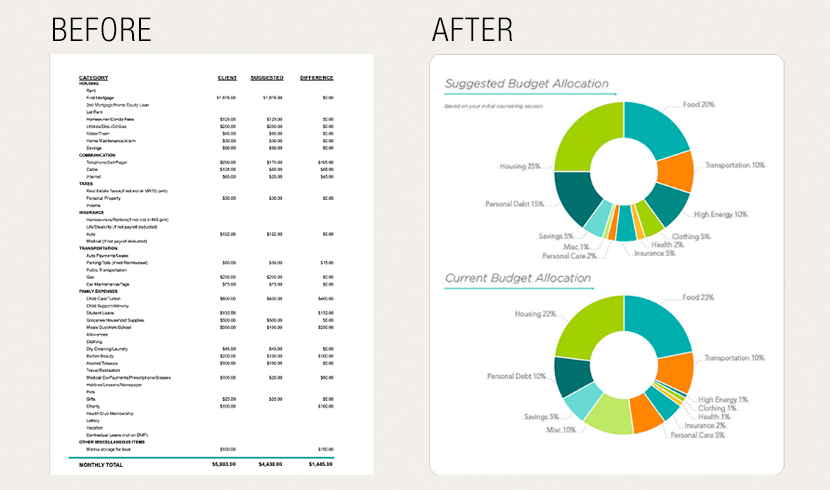
Numerical data (left) becomes easier to understand when visualized in a graph (right)
What Design Visualizes – Ideas
The next thing that design can visualizes is ideas.
Slides and demo videos used for business presentations and startup pitches are examples of this.
By visualizing an idea that is only in one person’s head in a form that is easier to understand than words, it becomes easier to convey its value to others.
Making the value of an idea easier to recognize through design makes it easier to get others involved, justify budgets, and receive investment. With a little help from design, great new ideas can take flight and ultimately lead to innovative products and services!
As seen below, a well made design can visualize an idea much better than a simple sketch.
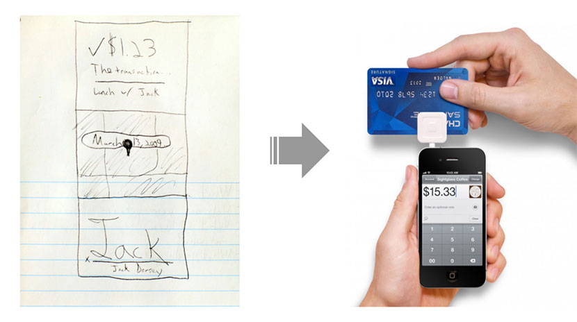
Sketch visualizing Square’s service concept
What Design Visualizes – Brand
One of the roles of a designer is to design a logo or brand identity.
The role of a logo is to make it easy to recognize a brand at a glance.
A logo can visually expresses the values of brand to the world in a way that is easy to understand.
In this way, logo design = visualization of a company’s values.
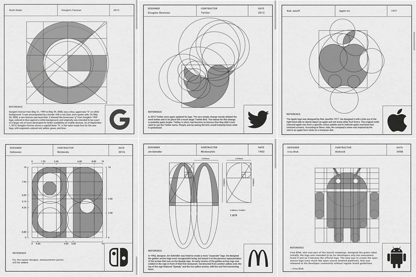
Logos that visualize the values of each company and product.
What Design Visualizes – Experience
If one of the roles of design is to “visualize the invisible,” then visualizing “experiences” will help convey the message.
How is it possible to visualize experiences? You may think it’s impossible, but in fact, it is already being done in a variety of ways.
One common example of this is advertising.
From television and the internet to billboards on street corners, many advertisements do more than introduce products; their most important role is to communicate through the visualization of the experience gained from the product.
The surface elements used in design, such as typography, color, shape, layout, and space, are more than just visual elements; they have an emotional and psychological impact on people, and are important elements that shape the impression of the experience itself.
Through good design, visual elements can be designed with consistency and affect the emotions and perceptions of the user, enabling more effective communication.

An iPod billboard advertisement that intuitively conveys the experience of using the product.
Role of Design 2: Problem Solving
Design is a process of problem solving and the pursuit of beautiful solutions.
– Don Norman
The next role of design is problem solving.
I myself have long been asked, “What is the definition of design?” I have almost always answered, “The most efficient process for solving a problem.
Especially in the fields of design that have been attracting attention since the beginning of the 21st century, such as design thinking and UX design, the purpose is often defined as solving users’ problems.
And many products in today’s world are created to solve consumer and user issues.
Here are some examples of how design has actually solved problems. Although not necessarily solved by design “alone,” we would like to show that design plays an important role in solving problems.
Example of a problem solved by design: Toaster
A retro style toaster. The appearance and the way the bread pops out when it burns are both very cute.
In fact, this design solves a certain problem.
It is designed to prevent overcooking and to let you know when the bread is done.
If the bread doesn’t pop out when it is done toasting, it’s hard to tell when it’s done toasting, and if left unattended, it will burn.
By designing the bread to pop out when it is baked, the two problems are solved.

Toaster design that solves the problem of burnt bread.
Example of a problem solved by design: Stackable chairs
Another example of a design that solves a problem by saving space is a design that allows multiple chairs to be stacked on top of each other.
Even in Japanese elementary schools, chairs are stacked and placed in the back of the classroom for cleaning after classes are over.
Although it is often taken for granted, stackable chairs are also a function of well-designed ingenuity.
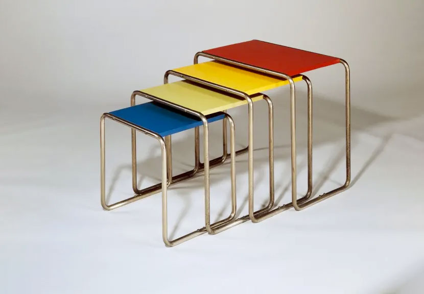
Stackable designs solve space issues.
Role of Design 3: Guidance
Design is not about how something looks, but how it functions.
– Steve Jobs
From time to time “Design Fails” will go viral on social media.
These designs are considered to be “Fails” because the design was not producing useful results for the user, or in some cases, misleading users.
One example is this public restroom signage. It’s a bit difficult to understand from a glance.
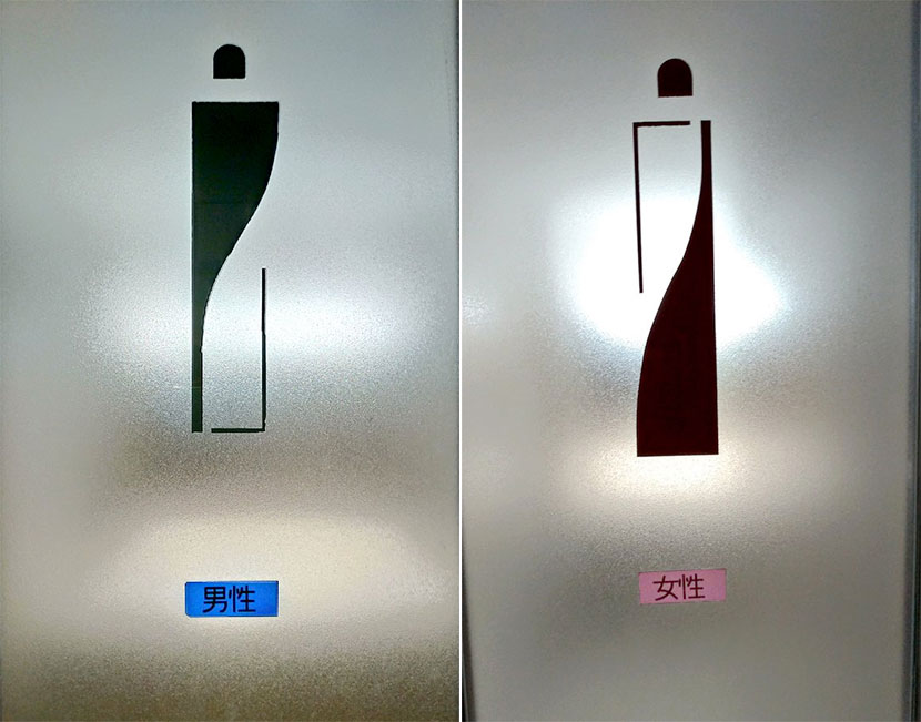
It’s hard to tell just from the design so labels were added.
This restroom signage dares to adopt a style that strays away from typical designs that evoke gender. Perhaps they aimed for an inclusive design to avoid sexist expressions? It’s hard to say.
However, signs like this can make it difficult to distinguish between men’s and women’s use, which in turn would confuse users.
In response to this, a tape label with the words “male” and “female” was made and applied by hand to the lower part of the screen afterwards. This is less than ideal.
When an initial design fails to guide the user correctly, measures like this are sometimes necessary.
Now, let me show you an example where the user is guided correctly. For clarity, let’s use the same public restroom sign.
Here it is.

Design of a typical public restroom sign.
This is much easier to understand.
The design, colors, and placement of the icons are quite clear, with women on the left and men on the right. Additionally, the fact that there is a multipurpose restroom in the center can be understood at a glance.
Even if the design is not necessarily “stylish,” it leads users to the right place, fulfilling the goal of the design.
Shampoo and conditioner bottles designed to guide users
Let’s take a look at this Japanese brand “Merit” and the intuitive design of their shampoo and conditioner bottles. This is a great example of how design can guide it’s users.
When showering, it is difficult to open one’s eyes and identify the difference between shampoo and conditioner bottles.
By applying bumps to the top and sides of the shampoo bottle, the design allows the user to differentiate between the two bottles. Allowing then to know whether the bottle in their hands is shampoo or a conditioner by touch alone.
This design guides users to the respective bottles.

Bottles with the advantage of being able to identify shampoo and conditioner just by touch.
This means that the design is not just about visual aesthetics; it is also closely related to the ease of use and functionality of the product.
We can see how a simple and intuitive interface can serve to guide users in the right direction without leading them astray.
Sign-up form guided by intuitive operability
Guidance by design is often seen in the digital world as well.
Let’s take this sign-up form as an example to see how the design guides the user.
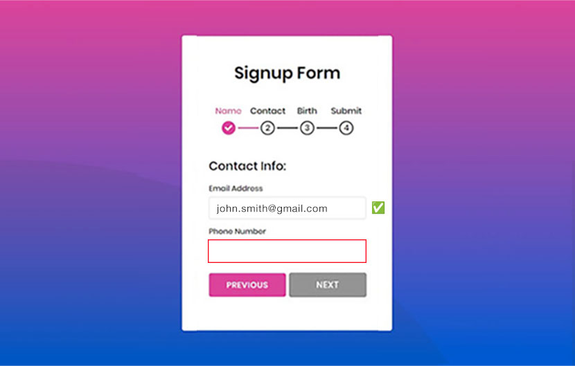
Example of a form that successfully guides users.
First of all, the four steps to create an account are clearly indicated at the top of the page, which gives users a sense of security.
When a field is filled in, a ✅ symbol appears to let the user know that he or she has filled in the correct information.
Conversely, items that have not been entered are outlined in red, again intuitively guiding the user what still needs to be entered.
Additionally, if you fail to enter the required information, the “Next” button remains gray and cannot be pressed. This intuitively tells you that you can’t proceed until you’ve entered all of the required information.
This form is a great example of design that gives users more intuitive guidance as opposed to the type of form that shows an error message only after a wrong entry, sending users searching through the form to find the missing information.
The role of design is to guide
Design is not just about “how it looks,” but it is also a very important element that includes broader implications for functionality, human experience, and emotion.
That said, in the past few years, the importance of design thinking, design management, and UX and UI design has been emphasized, and there is a growing recognition that design is not just about visual beauty, but also a method for optimizing the user experience.
Role of Design 4: Simplification
Design is about simplifying the complex.
– John Maeda
The last of design’s roles is to simplify.
Perhaps this may seem a bit mysterious to you. This is because it is not surprising that simplicity itself has value. Especially until recently.
First of all, please take a look at this image.
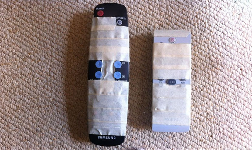
An example of a more “user-friendly” remote control.
This is a TV remote control in a home, most of which is hidden by tape.
The reason for this is that it is confusing.
The remote control is used by elderly people, and the complicated button operations are a hurdle in their daily lives.
So, they made the remote control “simple” by themselves.
This example shows the benefits of simplicity.
Perhaps that is why remote controls are becoming much simpler these days.
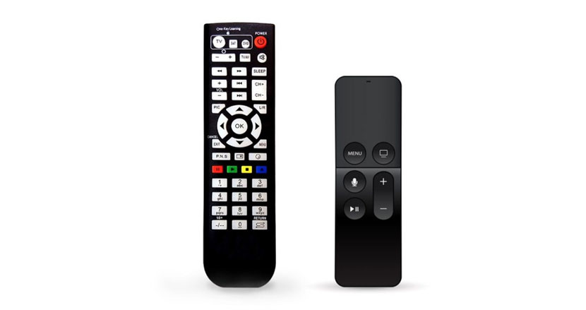
The fewer buttons you have on your TV remote control, the easier it is to use.
Making something simple, however, is quite challenging.
If you have studied design even a little, you have probably heard the expression “Less-is-More.”
Leonardo da Vinci once said, “simplicity is the ultimate form of sophistication.”
That’s how much simplicity, in the designerly sense, is one of the ultimate goals.
In general, the concepts of “decluttering” and “minimalism” have become more and more popular. Until recently, it was assumed that more of everything was more attractive to users.
It turns out, there are quite a few benefits to be gained by simplifying design, we listed a few below.
Benefits of Simplicity
- Less likely to get lost
- Less likely to break
- Less wasted time
- Less stress
- Less expensive
Take the Starbucks logo, for example. The Starbucks logo is getting simpler with each redesign, with fewer colors and lines.
The latest logo uses simple lines and only one color, green, compared to the previous logos which were more complex.
When considering the cost of printing the logo on multiple store signs and a vast number of cups and products around the world, simplifying the logo has certainly led to considerable cost savings.

Starbucks logo getting simpler with each redesign, with fewer colors and lines.
The latest one utilizes simpler lines and only one color, green, compared to the previous complex two-color logo.
A minimalist design not only offers the advantage of being “unbreakable,” but it also minimizes the risk of potential issues.
By reducing the number of elements in the logo, the likelihood of breakage is significantly diminished. This principle holds true across various domains, where simplicity translates to resilience.
In the realm of user interface (UI), a streamlined design with fewer elements is less prone to bugs, analogous to how concise sentences are less likely to contain spelling errors.
Taking hardware as an example, a design with fewer components decreases the probability of breakage. Moreover, in the absence of corresponding parts or screws, there is no opportunity for breakage or loosening, reinforcing the concept that simplicity contributes to robustness.
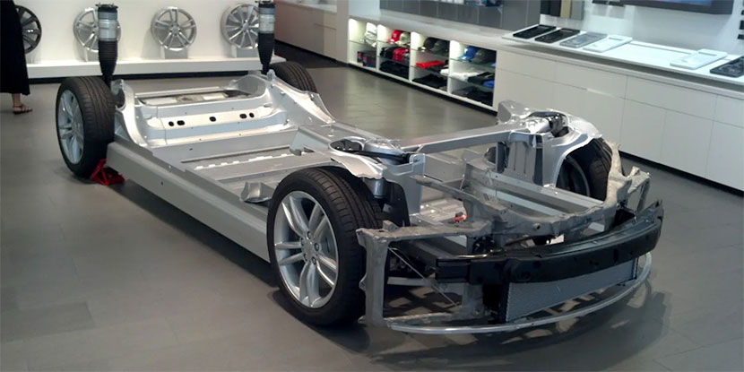
Skeleton model displayed at a Tesla dealer. It is very simple with only a few component parts.
Apple’s credit card follows the same idea.
The card focuses on making things easy and straightforward to give users the best experience possible.
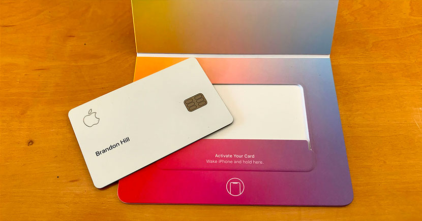
Apple Credit Cards designed for simplicity.
Pursuit of Simplicity with the Apple Credit Card
- Card application: from within the Wallet app → less hassle
- Waiting time to start using the card: Instant access from within the Wallet app → No waiting time
- Card number: In Wallet app → No indication on the card
- Expiration date: In Wallet app → No notation on the card
- Security code: in Wallet app → no code on card
- Activation: Package and iPhone → Not available except for the cardholder
- Terms and conditions document: in Wallet app → no thick document
- Usage process: iPhone notifies you when you use the card and in some cases approves it → no signature
- Statement: In Wallet app → Always check, no need to wait until the end of the month
- Change number: In Wallet app → No need to reissue card
- Annual fee: No charge → No reason not to apply for a card!
Simplified Convenience with the Apple Credit
- Card Application: Easily apply within the Wallet app for a hassle-free process.
- Activation: Instant access within the Wallet app, exclusive to the cardholder.
- Wait Time: No waiting time – start using the card instantly within the Wallet app.
- Card Details: Card number, expiration date, and security code all conveniently located within the Wallet app – no information on the physical card.
- Terms and Conditions: Accessible in the Wallet app – no need for a thick document.
- Usage Process: iPhone notifies and, in some cases, approves card usage – no signature required.
- Statements: Always accessible in the Wallet app, allowing constant monitoring without waiting until month-end.
- Change Number: Effortlessly update your card number within the Wallet app – no need for a card reissue.
- Annual Fee: No charge – giving you every reason to apply for the card!
Indeed, simplicity plays a crucial role in design.
Put differently, a state of simplicity embodies near-perfect design.
Good design creates products and brands that people love
Enzo Ferrari, founder of the luxury sports car brand Ferrari, said that good design has two advantages.
- They are loved for a long time
- This love leads to a greater number of sales.
A well-designed product is not only more likely to be loved by many but also tends to sell better, offering significant business advantages.
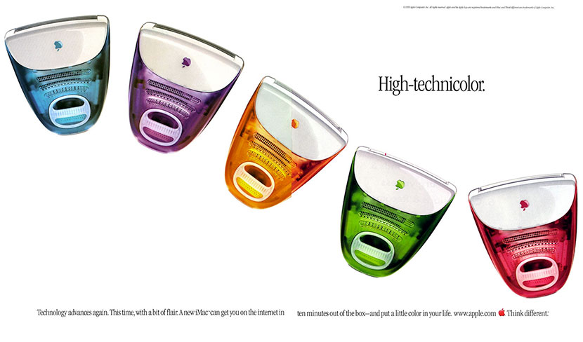
The first iMac that saved Apple from bankruptcy.
Take the Apple iMac, for example—it not only garnered widespread admiration but also played a pivotal role in rescuing Apple from the brink of bankruptcy.
The success? Rooted in its exceptional design quality.
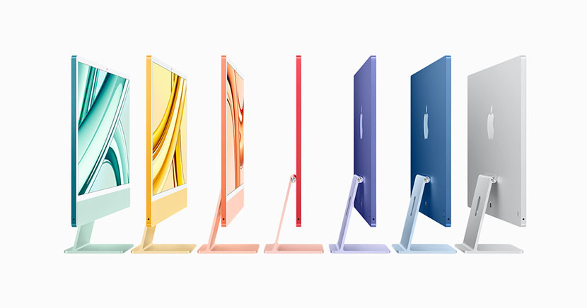
The iMac’s high design quality continues in the modern version.
Summary: What is design?
So, in essence, the answer to the ultimate question, “What is design?” It is the art of crafting a product or service that fulfills the four roles mentioned.
- Visualization
- Problem Solving
- Guidance
- Simplification
When executed skillfully, it results in offerings that resonate with people, fostering love and achieving strong sales. This underscores the precious and vital nature of design.


